
Back at Google I/O 2019, Google revamped the UI of Lens, its visual search tool that can scan text and images to shop items, look up something on the web, translate, extract text, and more. While the company was unable to host its I/O event this year, they still released new features and modes for Google Lens, such as the ability to copy text to Chrome on a PC. Now, Google is testing a slight tweak to the design of Lens that makes it easier to import images to scan.
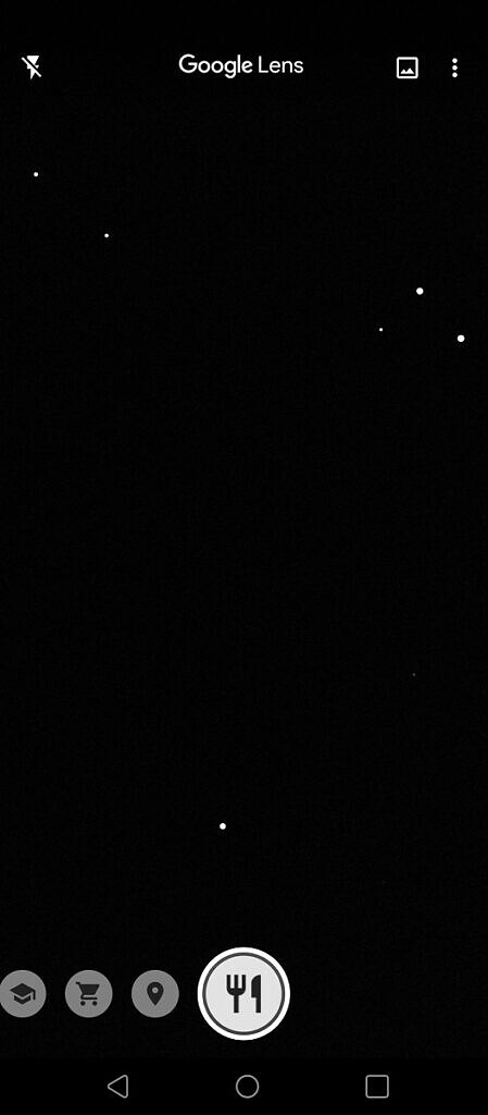
Max Weinbach informed us that he’s seeing a new UI in Google Lens that shifts the gallery button from the top right to the bottom left next to the shutter button. In addition, the title of each mode is now persistently shown below the shutter button rather than only being flashed in the center for a brief moment as you switch between modes.

Here are some more screenshots of this new Google Lens design:
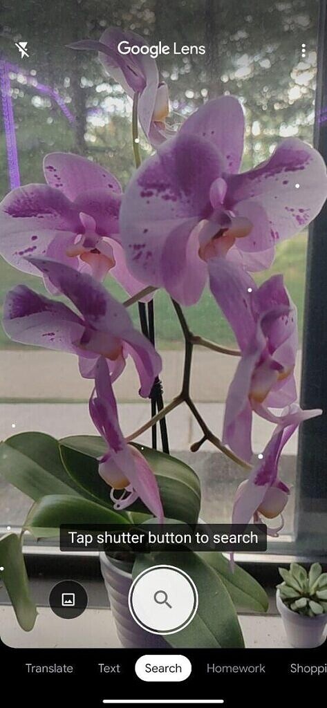
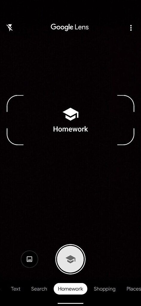
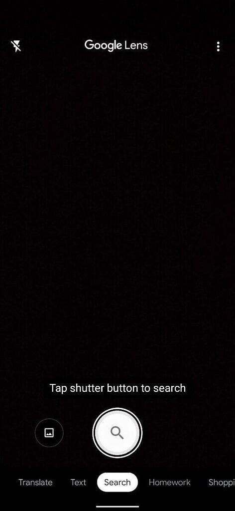
New Google Lens design
The new gallery button placement makes sense because it makes scanning images much more accessible on taller devices. Always showing what mode you’re in at the bottom also makes sense as Google continues to add new scanning modes to Lens, such as the recent homework mode. This way, users can quickly figure out what mode they need to switch to rather than guessing what mode they should pick based on its icon.
You can download the Google Lens app from the Google Play Store link embedded below, but keep in mind that it’s merely a shortcut to the service that resides in the Google App. This new design is available on all of Max’s devices, but I don’t have it on any of mine yet. It’s likely that Google is testing this new design with a small number of users before rolling it out more broadly.
Google Lens (Free, Google Play) →
The post Google Lens tests a new design with easier access to the gallery appeared first on xda-developers.