
Google recently announced that they have shifted the Mobile-First Indexing deadline from September 2020 to March 2021. The pandemic is still in its full swing across various parts of the world, making it hard for SEOs, developers, and webmasters to prepare for this shift. Thus, Google has decided to give some more time to all the pros and website owners so that they can make their websites ready for mobile-first indexing before they enable automatic migration for all sites.
We’re still working on Mobile-First Indexing — and have decided to make a bit more time for sites to prepare.
Curious about some of the issues to watch out for? Find out more in our post
https://t.co/AZ2cgtWNkw
— Google Webmasters (@googlewmc) July 22, 2020
Previous Announcement of Mobile-First Indexing Deadline
Google declared on March 05, 2020, that the deadline for mobile-first indexing would be September 2020 but at that time the world was still not that deep into the coronavirus pandemic. The whole world was still processing what’s going on and what needs to be done. Amidst all that, Google said that they will be switching to mobile-first indexing for all websites starting from September 2020 to simplify things.
However, between March and July 2020, things have dramatically changed.
Latest Announcement of Delay in Mobile-First Indexing Deadline
In response to the current situations, on July 21, 2020, Google said, “Our initial plan was to enable mobile-first indexing for all sites in Search in September 2020. We realize that in these uncertain times, it’s not always easy to focus on work as otherwise, so we’ve decided to extend the timeframe to the end of March 2021”.
“70% of Sites in Search Have Already Migrated”
Google introduced the process of mobile-first indexing in 2016. Now it’s been almost four years, meaning we have had enough time to embrace this change. Moving to mobile-first indexing has been an ongoing effort of Google over these years. So, there is nothing to be surprised about this change now.
When Google previously announced the deadline for mobile-first indexing, it said “70% of those shown in our search results have already shifted over”. Google further added that, in the meantime, they will be moving sites to mobile-first indexing when their systems will recognize that sites are ready for the shift.
Google has enabled mobile-first indexing for most currently crawled websites and enabled it by default for all new websites.
How to Be Ready for Mobile-First Indexing Before March 2021
Now, when all of us have got more time to be ready, it’s time that we pull all the strings to make the move smooth and stress-free. It is best for you if Google moves your sites voluntarily when the time comes rather than forcing your website to mobile-first indexing. There are different ways to check the status of a website for mobile-first indexing and the easiest one is through the Settings Page.
How to Check the Status of Your Website for Mobile-First Indexing
- Log in Google Search Console.
- Go to Property Settings to see which Googlebot is indexing your site – Googlebot Desktop or Googlebot Smartphone.
- Right along with the Googlebot type, you can also see the exact date when Google switched your site from desktop to smartphone crawling if it has already switched.
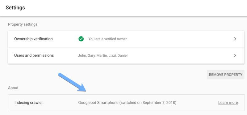
Image Source: Search Engine Land
Google also notifies you (the site owner) when the site is moved for mobile-first indexing. Apart from this, you can also use URL Inspection tools to see if Google has switched your website to mobile-first indexing or not.
In case your site has not switched to mobile-first indexing yet, it means your site is not ready and some issues are preventing your site from being crawled by Googlebot Smartphone.
But before you do anything, remember that mobile-friendliness and mobile-responsive layouts are not the requirements for mobile-first indexing, according to Google. Pages that don’t have mobile versions will still work on mobile and will be used for indexing. When it comes to ranking, mobile-first index is not going to change anything for ranking except for mobile content.
Mobile friendliness is a ranking factor on mobile but not for being in the mobile-first index.
However, there are some issues that can prevent your site from being mobile-first indexed. Google has shared some of the tips that you can follow to better prepare your sites. Some of these are:
A. Ensure That Googlebot Can See the Full Content
In mobile-first indexing, Googlebot (designed for mobile) gets to see the information of your site mentioned only on the mobile version. Thus, make sure that it can see the full content and all resources on the mobile version.
How to Make Sure That Googlebot Can See the Full Content of Your Site
- Robots Meta Tags
Use the same robots meta tags on the mobile-based site that you have used on the desktop site. When you use different tags, such as noindex or nofollow, Googlebot may fail to index your site or follow links on your page once mobile-first indexing is enabled.
- Lazy-Loading
Lazy-loading is a more common practice for mobile sites than desktop ones, especially in the case of images and videos. Google recommends using only best practices for lazy-loading. Don’t use lazy-loading for primary content related to user interactions, including swiping, clicking, or typing because Googlebot isn’t going to trigger them.
If neither you nor Googlebot is doing it, it means Google won’t be able to see those user interactions or images. As a result, they are not going to be indexed or shown in Google Images.
- Think Before You Block
Some resources have different URLs on the mobile version from those on the desktop version. Besides, sometimes, they are also hosted on different servers. Thus, to let Google crawl your resources easily, make sure that you are not disallowing Google to crawl them with robots.txt file. For instance, blocking the URLs of files with extension .css will prevent Googlebot from rendering your web pages correctly and that can be harmful to the ranking of your pages in Google Search.
B. Keep the Same Content on Mobile As Well As Desktop Version
It is best to ensure that your mobile version doesn’t have less or more data or different data from that of a desktop site. If it is, update the primary content because it will be used for indexing as well as ranking in the Google search engine. Keeping less data on the mobile version might hurt your site’s ranking in the Search when Google will make this shift for one and all.
How to Ensure That Both Versions Have the Same Content
- Use the same headings with the same tags on the mobile version as they are on the desktop version.
- Don’t miss any subheading as Google may not fully understand the page and it may negatively affect your page’s visibility.
- Don’t remove or add more data in the primary content of the mobile version. Keep it the same as it is on the desktop site.
C. Optimize Your Images and Videos
The images and videos used on your site’s mobile as well as desktop version should be better optimized. Use only supported formats of images and videos. Here are some of the attributes you should take care of:
- Image quality – Don’t use too small or low-resolution images on the mobile version as they might not be displayed in Google Images. Also, don’t use too small thumbnails for those images.
- Alt Attribute – Use meaningful alt text for both versions; otherwise, it may affect how images will be displayed in Google Images.
- Image URLs – Use the same image URLs for desktop and mobile versions to avoid temporary traffic loss from Google Images during migration. Avoid using URLs that change every time the page loads. The same goes for videos.
- Video Markup – If your desktop site uses schema.org’s VideoObject structured data for videos, use the same in the mobile version to help Google’s video indexing systems get enough information about your videos.
- Video and Image Placement – Place your videos and images on the mobile versions where they can be easily found to ensure seamless user experience. If videos are less visible to users and they have to scroll a lot to see them properly, Google might think that your page is not a useful video landing page.
Besides, place ads on your mobile site carefully so that they don’t harm the ranking of your website. Follow the Better Ads Standard while displaying ads.
D. Use the Same Metadata
SEO pros know how important metadata is to any site’s ranking and indexing. If a site is not indexed due to this issue, you know the severity of this condition. Thus, make sure that the descriptive title and meta description are the same on the mobile site and desktop site, respectively.
If your site is created using responsive design techniques, you will need little to no fixes. If not, then your site might have issues like missing structured data and missing alt-text for images on mobile pages.
It would be amazing if your site is already set for mobile-first indexing. Otherwise, Google has gifted you more time to fix those issues. All the above tips will help you get better prepared. In case you are not being able to do it yourself or don’t have enough time, professionals are always here to help you. Don’t hesitate to ask for assistance.