

Shortly after leaked images of a Windows 11 build appeared online, we managed to get ahold of a working copy of the OS. That’s right; we have Windows 11 installed—-in a virtual machine. We’re not totally crazy. And ready or not, we have initial impressions of a clearly unfinished operating system.
No Local Sign In For Home Users
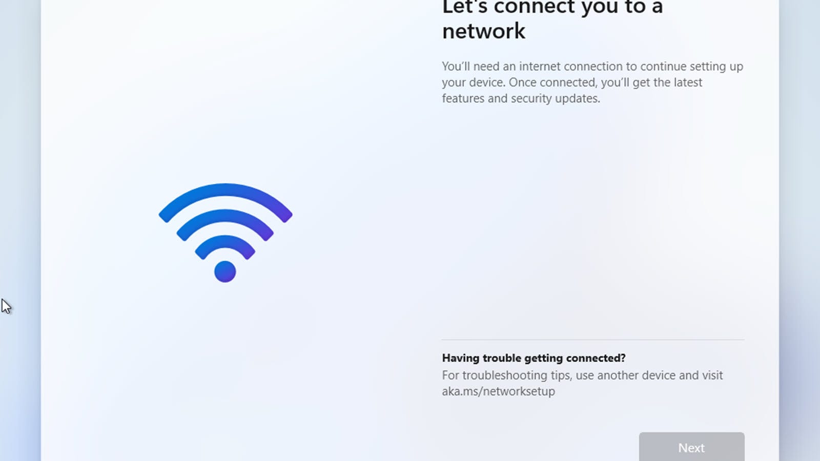
I set up Windows 11 in two different ways. First using the Standard Windows 11 Home option, then later Windows 11 Pro. During my initial setup of Windows 11 Home, I encountered a surprising change: Microsoft forces Home users to sign in with an online Microsoft account in this edition of Windows. Even tricks like disconnecting the network didn’t work. That just leaves you stuck on a screen demanding an internet connection.
Alas, Home users must use an online Microsoft account. At least in this copy, though, things could always change. But if they don’t and you do want a local account, you’ll need to spring for Windows 11 Pro. Most laptops and pre-built computers tend to come with the “Home” edition of Windows, though, so it’ll be interesting to see if Microsoft holds the line.
And as for activation, I managed to activate Windows 11 with a Windows 7 key. That’s an encouraging sign for upgrading users.
New Taskbar Look, With New But Limited Options

Start up Windows 11, and the most obvious change will hit you right away. The Taskbar buttons have moved. Now you’ll find them in the center, evoking a more “mobile OS” look to be generous, or perhaps a Chrome OS and macOS look to be less generous.
After digging through various settings, I have some good news. You can move the Taskbar buttons back to the left side if you prefer. And some bad news. If you prefer to keep your entire Taskbar on the side of the screen, perhaps because you have an ultrawide monitor, that option seems to be gone.
As with Windows 10, you’ll find dark theme options in settings along with several preloaded background wallpapers. Overall the new look feels like a bunch of modern polish, as do the new sound effects, which I’d describe as bubbly. That is until a glitch causes them to ding forever, and I have to restart the OS to save my ears. This is, folks, an unfinished build, and it shows.
Start Menu Killed the Live Tiles

Do you remember Live Tiles? The square and rectangular tiles that Microsoft introduced on Windows Phone, then brought over to Windows 8. On Windows Phone, Live Tiles were a revelation. I honestly liked them a lot. On Windows 8, they were an abomination. Everyone hated them, even this Windows Phone fan.
Part of the problem was Windows 8’s insistence on making the “Start Screen” full screen (as the name implies). Windows 8.1 tried to fix that with better desktop support, and the trend continued through Windows 10. But with Windows 11, Live Tiles are gone. And so is the “connected” start menu that touches the Taskbar.
Now, it’s a floating rectangle that almost serves as its own window. If you move the Taskbar icons to the left, you’ll get something a little more familiar. But even still, the Start Menu is now a mix of “pinned apps” and recommended files and folders. If you want to get to all your apps, you’ll have to click through to them.
The new look is bound to be controversial. Some people are going to hate it, I’m sure. And the best you can do is move things to the left. It won’t be the same, and I can’t find any options to customize the Start Menu—at least not yet. Another new thing? Rounded corners on all the windows, from the Start Menu to programs you install.
New and Better Windows Snap Options

One thing Windows has always done well is, well, windows. Specifically, the Snap features first introduced in Windows 7. And while the shake-to-minimize feature disappeared with Windows 10, I’m glad to say the Snap features actually get improvements in Windows 11.
In Windows 10, if you drag a window to a corner, you’ll get a faint, hard-to-see border that suggests how your window will reshape when you let go. In Windows 11, that changes to a dark border that’s easier to see. It’s a subtle but welcome improvement.
You’ll also find a brand new feature tucked into Windows 11’s maximize buttons. Open a program, whether it’s Chrome (of course I downloaded Chrome) or File Explorer, and right-click on the maximize button. Now you’ll find new snap options with a diagram showing where any window will end up. Click on one, and it moves your window. And, of course, Windows will pop up an option to snap a second window.
The new button diagram feature even has an additional Snap sizing that Windows 10 didn’t have. It’s a sort of “2/3rds of the screen for one window and 1/3rd for the other window” scheme. I like it because half and half isn’t always better.
The “News and Interests” Widget Gets a Downgrade

Windows 10 just started rolling out a new “News and Interests” widget, and we already have qualms with it, but somehow the Windows 11 version looks worse. It’s built-in right out of the starting gate, but in keeping with this “somewhat mobile device” new look, gone are the borders and backgrounds.
Instead, the news items float and litter up the place. That’s when it’s not broken. Did I mention this is a leaked and unfinished build? Yeah, not everything works. About halfway through testing, the stories disappeared, and suddenly the widget window gained a background. I have a feeling this widget will see a lot of changes before the final release version.
Mostly the Same
If you want to know the biggest thing I’ve noticed in my few hours with Windows 11, it’s all the things that haven’t changed. Start digging in, and you’ll see that everything is mostly the same. The settings panel is the same, and the control panel is too. Because, of course, we still have to deal with both a modern Settings UI and an aging control panel.
File Explorer doesn’t see much of a change, nor do virtual desktops. Alas, the action notification center is exactly the same, which means it’ll be mostly useless. And desktop notifications haven’t changed either. Basically, Windows 11 feels just like Windows 10 but with a skinned desktop. Once you get past the initial shock of the Taskbar and Start menu changes, it’s hard to find any other differences.
And maybe that’s for the best. Sure it’s tempting to want a giant overhaul; after all, it’s Windows 11, not Windows 10.5. But at the end of the day, at least a few minor changes to the main look might avoid another Windows 8 fiasco.
Maybe.