
Android 12 is going to look much prettier.
What you need to know
- Screenshots of Android 12 have emerged, showing what could be our first look at the new system-wide theming.
- We also get a look at the updated look for widgets, which could be in response to Apple’s neatly designed widget system.
- The first developer preview of Android 12 is expected to arrive as soon as this month.
Android smartphones are still in the process of receiving the Android 11 update, but the tech world waits for no one, and Android 12 is already being prepared for its first developer preview soon. There have been tidbits of information here and there on what to expect for the update, and while Android in its current form seems pretty full-featured at this point, there’s always something that can be improved or implemented. It seems we’re getting our first look at some of these improvements thanks to screenshots recovered by XDA-Developers.
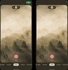
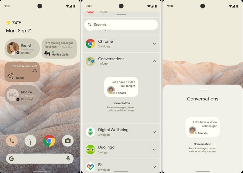
The screenshots show a bright, cream-colored UI that could be our first look at the improved system-wide theming system that’s said to be introduced in Android 12. Some of the best Android phones have their own version of themes that you can buy from their respective stores, but this would likely bring a more consistent experience across the Android ecosystem. It was recently hinted that this could make it to Android 12, and allow users to choose both a primary and accent color or the system could suggest a theme based on the wallpaper which looks to be the case here.
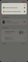
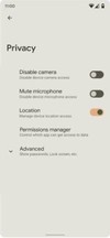
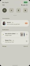
Google also looks to be implementing a way to notify the user when device peripherals are being used, such as the camera or mic, by placing a highlighted icon at the right of the status bar. When clicked, it would open to tell you what apps are using which peripherals. The device privacy settings show the ability to easily access toggles to allow or block access to these functions.
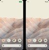
There appear to be some changes coming to the notification shade as well, with the number of quick panel buttons seemingly reduced to just four when contracted. The buttons also may change shape when activated, as noted by the darkened, circular WiFi toggle next to the brighter, squircle toggles. As far as the notifications, they appear to be more rounded and the toggle to expand them is now highlighted to better separate from the rest of the notification. The date and time have switched positions.
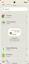
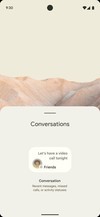
The widgets are also getting an overhaul, which is one of the six features we wanted to see in Android 12, making them appear more deliberate and somewhat consistent. It’s unclear exactly how Google plans to alter the widget system in Android 12, as it appears the conversation widget has different shapes and only accommodates one conversation type per widget. Hopefully, Google manages to give the widgets a meaningful overhaul, especially after seeing how well Apple executed its first implementation in iOS 14. The widget selection screen also looks much neater and organized.
As noted by XDA-Developers, these screenshots are from Google documentation regarding changes being made in Android 12. The screenshots haven’t been verified, so that with that what you will, but they apparently come from a trusted source. They are reportedly what Google plans to present to OEMs to prepare them for the changes coming to the OS. That said, much of this could change, and some of the features could disappear down the road once the developer preview is released and people get their hands on these new features.