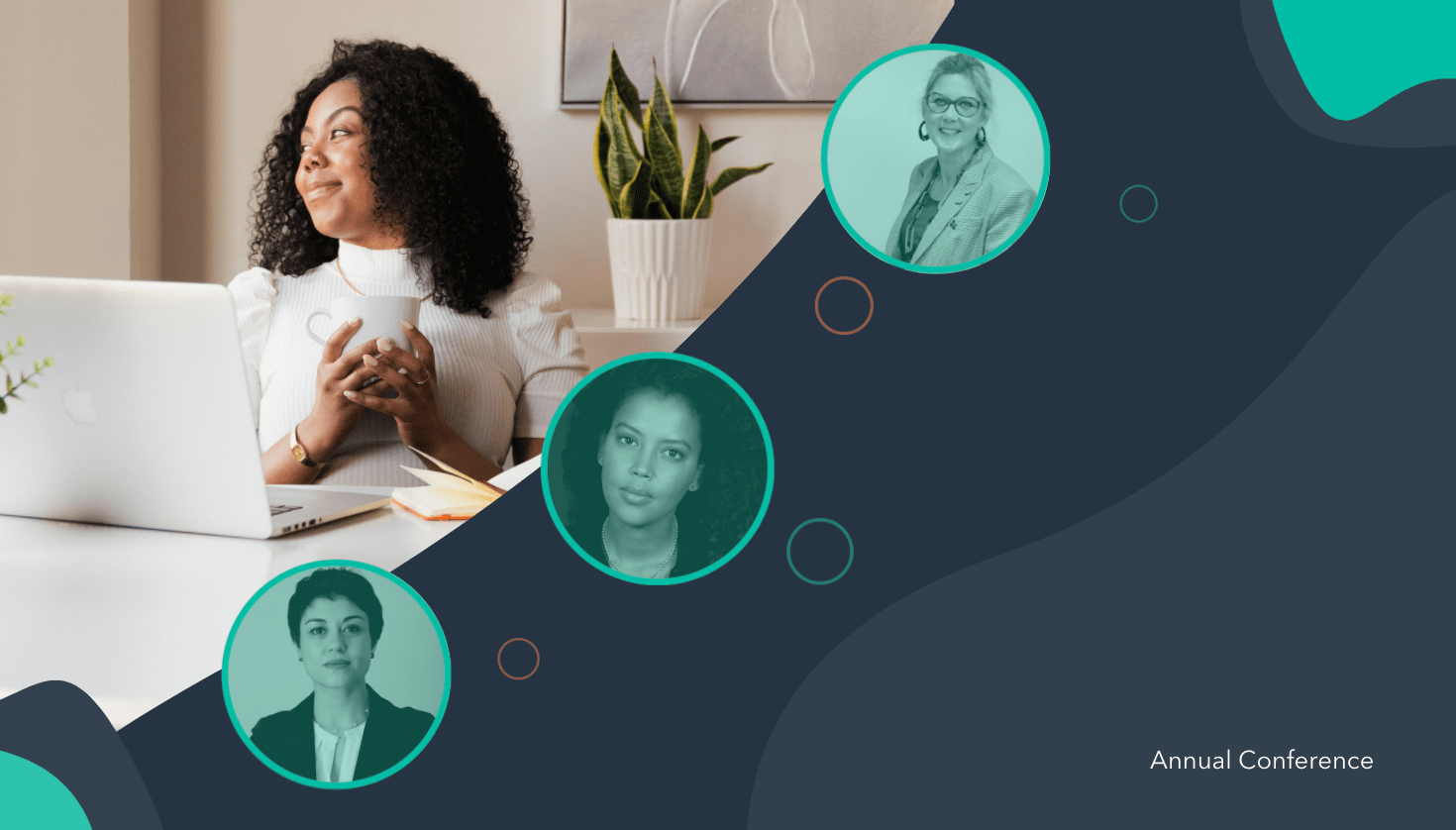
A conference is a powerful opportunity to establish authority in your industry, increase brand awareness, and inspire or entertain both prospects and your existing consumers.
Best of all, a conference can help you meet your team’s objectives. In fact, 95% of marketers believe in-person events can have a major impact on achieving their company’s primary business goals.
In 2020, the majority of events were hosted virtually — and this likely isn’t going to change in 2021 or immediately beyond.
And, in a world of digital-first, a website is many people’s first introduction to your event. A conference website can influence whether someone clicks “Buy Ticket Now”, or abandons the page entirely.
No pressure, right?
Here, we’re going to explore 21 of the coolest, most inspiring conference websites we’ve found. Use these examples as inspiration as you’re designing your own.
Conference Website Design Best Practices
Before we dive into the examples we’ve collected, let’s explore some best practices to keep in-mind when you’re designing your own conference website.
A good conference website design should include:
- Put your location and date above-the-fold: People should know immediately where, and when, your event is taking place. If they can’t find it easily, they could abandon your website completely. Before you dive into speakers or any other information, ensure your visitors know whether they can even attend in the first place.
- Use interactive elements: Videos or animated graphics can go a long way towards making your website look sleek and professional. Plus, video is a good opportunity to showcase events from years past.
- Center the page around your visitor: What’s in it for them? Great speakers to inspire their work? A chance to network with industry leaders? Ensure your copy outlines, clearly and concisely, how your website visitor will benefit from your event.
- Have a clear call-to-action: Your page is ultimately meant to convert web visitors into event attendees — so make this easy to do. Create a bold “Register Here” or “Buy Tickets” button so your visitors can easily convert when they’re ready.
- Include fun visuals: One thing that’s apparent in all the conference web designs we chose is interesting, unique, fun visuals. I wasn’t impressed by conference websites with too much white space. Use visuals to grab your visitor’s attention, and communicate through images what your event is all about.
- Create time-pressure by including a countdown feature: In a few of the websites we’ll look at, below, you’ll see a countdown that outlines how many days, hours, or minutes visitors have left to sign up for the event. This is a fantastic way to create momentum and encourage visitors to sign up immediately, or risk missing out.
Now that we’ve covered some conference website best practices, let’s see how these 21 conferences put those ideas into practice.
1. Leading Design Festival
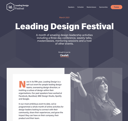
Color is an important factor to consider when designing any webpage, and this homepage for the Leading Design Festival does a good job using complementary colors to evoke a sense of warmness. Additionally, you have everything you need at the top of the page — including a button to purchase tickets, the date of the festival, and what you’ll get for attending (a month of design leadership activities). This page proves oftentimes, less is more.
2. Canvas Conference
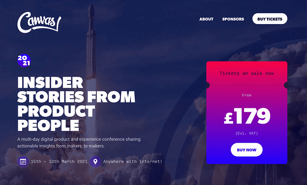
I can’t think of many images more inspiring than an image of a rocket taking off for outer space, which serves as Canvas’ backdrop image for the conference homepage. Additionally, the page doesn’t shy away from bright, vibrant colors — like purples, pinks, and blues — to attract the visitors’ attention.
Plus, the price is clearly stated front-and-center, which helps visitors know whether they can afford the event before exploring anything further.
3. London’s UX Fest
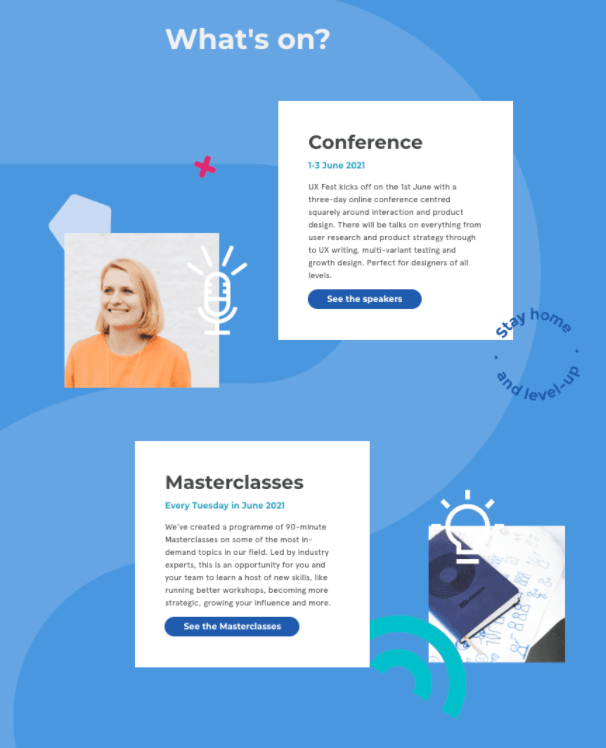
This scroll-triggered, interactive page is so fun, I scrolled it a few times. As you move down the page, you’re introduced to new information about the conference, with fun, unique design elements, like the “Stay Home and Level Up” image to the right of the first Conference box. Best of all, the page is incredibly simple, with plenty of blue space on either side, to evoke a sense of calmness as visitors learn about the conference.
4. GOTOpia Chicago
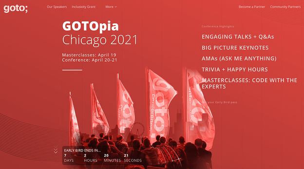
One of the best features of this conference page is the “Early Bird Ends In…” countdown that appears above-the-fold as soon as a visitor enters the site. The sense of urgency encourages visitors to sign up immediately, or risk losing out on a good deal. The page also does a good job outlining all the critical information you need to know in just a few words — including “Engaging Talks”, “Keynotes”, and “Trivia + Happy Hours”.
Plus, who doesn’t love the bright vibrancy of a red-and-white color scheme?
5. Consumer Technlogy Association 2021
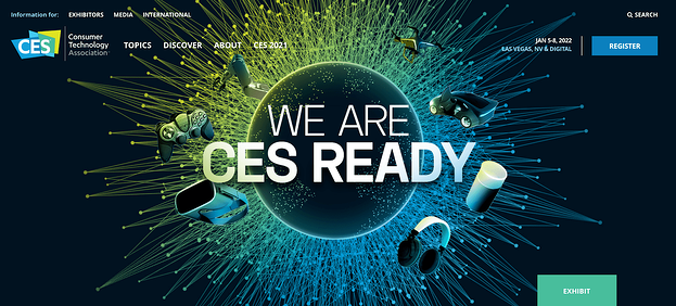
The CES conference page uses 3D visuals to grab a visitor’s attention immediately, with a simple “We Are CES Ready” tagline. The design is vivid and dynamic, and looks high-tech — undeniably the goal of CES. The page offers all necessary information, including date, location, and a CTA, from the very top of the page, ensuring CES-fans can sign up immediately.
6. Affiliate Summit East
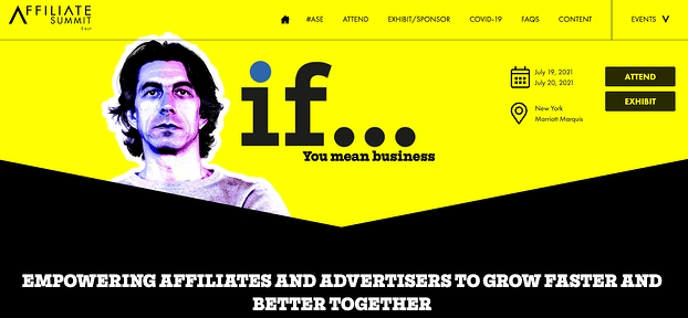
“If … you mean business” is a compelling statement that hooked me from the get-go. The entire page does a good job explaining how a visitor will benefit from the conference, including the state of the ecommerce industry in 2020, and how ASE can help you. This is a powerful page that makes the most of the real estate to demonstrate why ASE is an important conference for anyone in the retail industry.
For instance, on the homepage, they write: “Right about now you are probably asking yourself, ‘How on earth do I reach and convert buyers in the most competitive retail environment ever?’ We asked ourselves the exact same question and have built ASE21 to help you.” This page successfully keeps attendees’ needs and challenges at the forefront of the messaging.
7. Digital Design Days
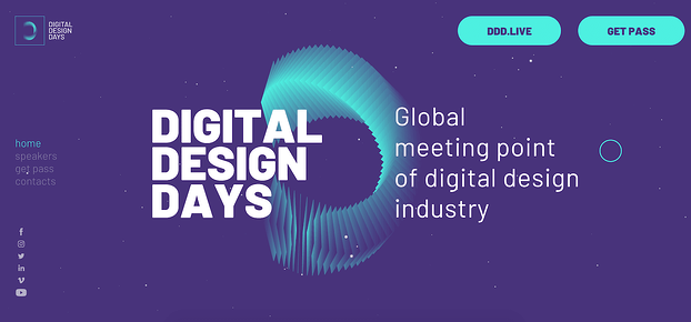
This colorful, sleek-looking homepage uses purples and greens to evoke a futuristic vibe. What I loved most about this conference website was the moving, interactive elements they’ve used to keep your interest as you scroll the page, including exploding visuals and continuously-moving debris. Give it a try for yourself — it’s more entertaining than you might think.
8. Circles Conference
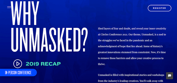
When attendees are choosing which conferences are worth their time and resources, one of the first questions they’ll ask is, “Why this conference over all others?”
This question is answered immediately on the Circles Conference homepage, and it’s answered using powerful, engaging text. For instance, the first sentence you’ll read in response to “Why Unmasked?” is “Shed layers of fear and doubt, and reveal your inner creativity” — convinced yet?
9. Collision Conference
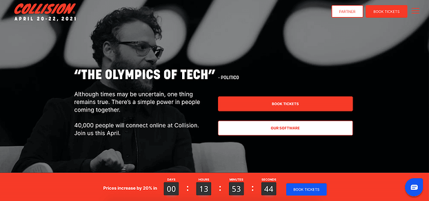
Seeing Seth Rogan at the top of the page is undoubtedly reason enough to pause on the site for anyone who’s a fan. Plus, “The Olympics of Tech”, a quote from Politico, does a good job demonstrating the value of the conference.
But what impressed me the most was the “Prices increase by 20% in…” countdown, right beside a bright blue “Book Tickets” CTA. For anyone whose eager not to lose money, this is a compelling argument for booking tickets immediately.
10. An Event Apart
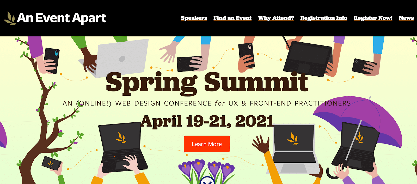
Consider standing out from the crowd by using in-house designs on your homepage, like An Event Apart does. The page is cheerful and colorful, and provides all critical information in only a few words. Before a visitor has even scrolled, they’ve learned where (online), when, and for whom the conference benefits.
11. Startup Grind Global Conference
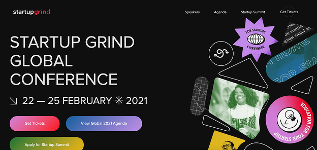
Using a mixture of photography and unique design shapes works well in this case, and the bright purple, pink, and green colors you see at the top of the page contrasts well against a simple black backdrop. The page is sleek and uses three bold buttons to provide all information a visitor will need to learn more, or purchase tickets.
12. The Martech Summit Singapore
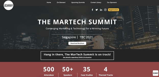
If you’re hosting a conference in a unique or exciting location, consider using an image of that location as a compelling backdrop. In this case, The Martech Summit used an image of Singapore to remind website visitors of the other benefit they’ll get if traveling from another location for the conference — a trip to a vibrant city. Plus, the attendee count helps persuade hesitant buyers who likely don’t want to feel like they’re missing out.
13. React Day New York
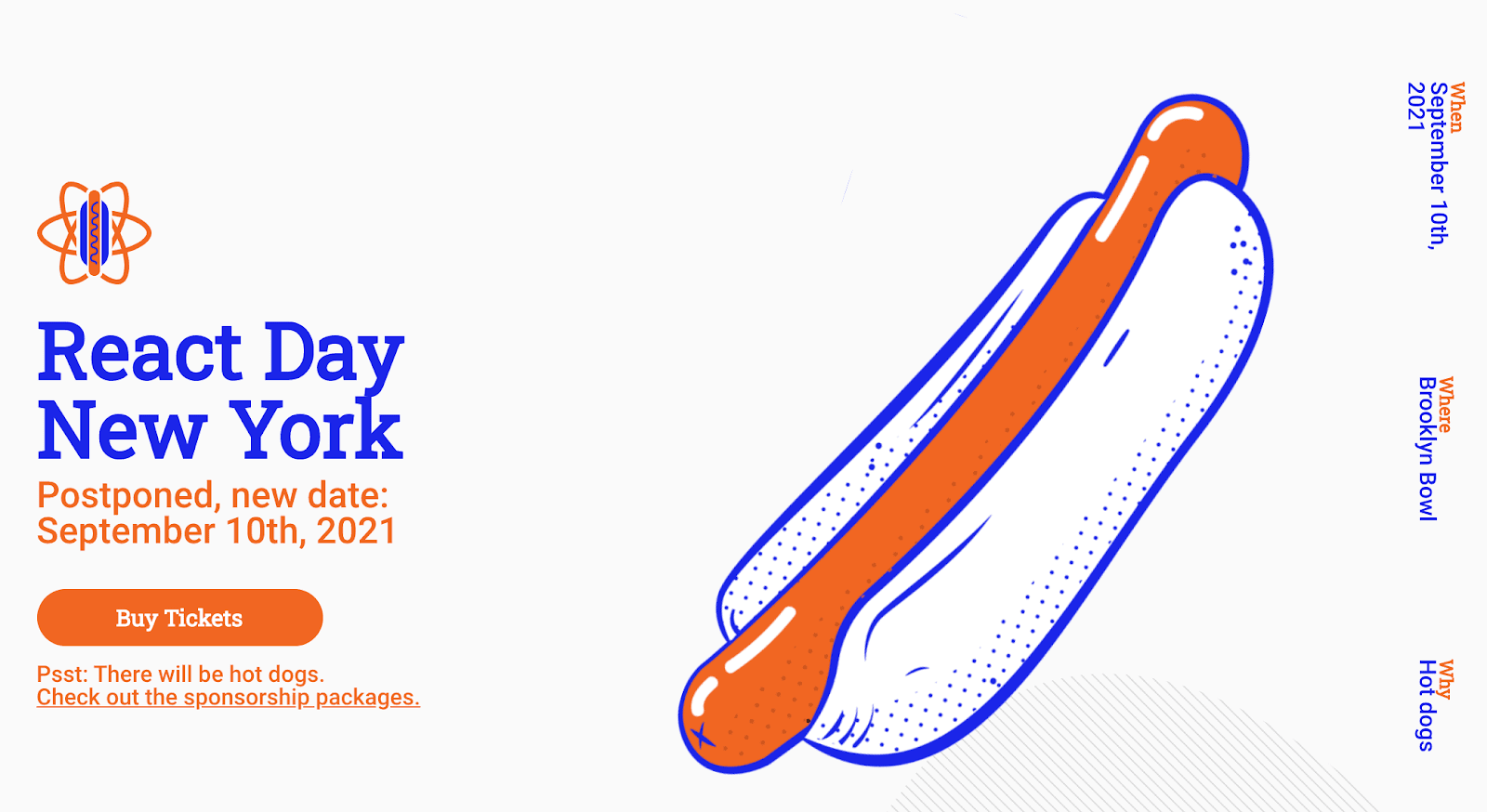
First off — who doesn’t love hot dogs?
This React Day page does a great job using humor to stand out. Not only is there a big illustration of a hot dog — which hooked me immediately — but there are multiple mentions of hot dogs, including below Buy Tickets (“Psst: There will be hot dogs”), and used in response to “Why” to the right of the page.
Consider how you might use humor on your own conference homepage to surprise and delight new audiences.
14. INBOUND 2021
Okay, okay — I might be biased, but hear me out.
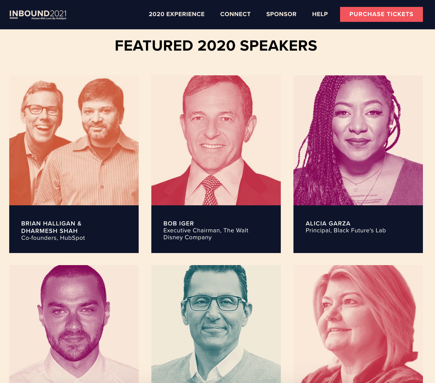
This INBOUND page demonstrates the speakers from INBOUND 2020 to excite and impress visitors with the possibilities of similar popular speakers in 2021. This is a good idea if your conference has pulled in some big names in conferences’ past, to give visitors a sense for what they can expect at an upcoming conference if you haven’t officially released upcoming speakers.
The top of the page also effectively outlines all necessary information, including sponsorship opportunities and a prominent “Purchase Tickets” CTA.
15. ProductCon
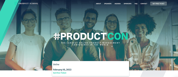
One element that made this #ProductCon page, a conference held by the Product School, stand out to me was the easy-to-find “Get Free Ticket” box, which is front-and-center for new visitors. Particularly if your conference is online and free — which creates minimal barriers to entry — it’s a good idea to make it easy for prospects to sign up instantly.
16. IBM’s Think
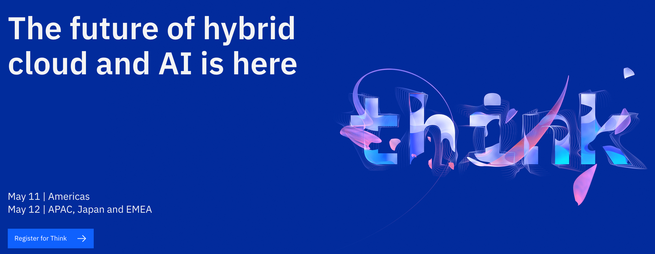
One of the cleaner, sleeker designs in this list, IBM’s Think page employs a bright blue background and minimal text to simplify the user experience. You’ll find everything you need to know at the top of the page — including the topic of the conference, dates, and how to register.
Consider how you might use similarly powerful and concise language to tell new visitors what your conference is all about.
17. AdWorld Conference
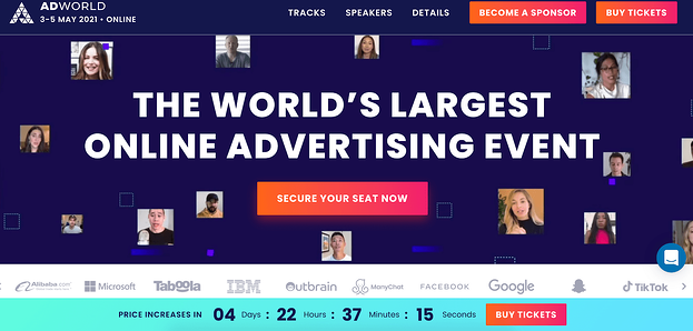
If you’re going to have some impressive companies in attendance at your event — including Google, Facebook, and IBM — it’s a good idea to showcase them on your conference’s homepage, like AdWorld does in the example above. Plus, what really stands out about this example is the small videos of various speakers that move across the page, creating a dynamic and unique experience.
18. Growth Marketing Summit 2021
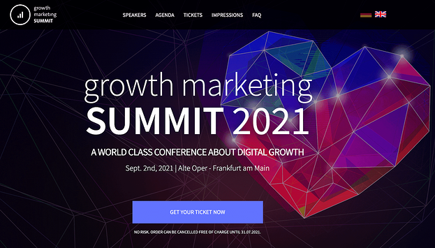
One element I appreciated about this page was the clear, “No Risk. Order Can Be Cancelled Free of Charge…” text right below the CTA, which helps dissuade any visitors’ concerns over being unable to attend and losing money. The page effectively leverages bright colors and a futuristic-looking heart to grab visitors’ attention from the get-go.
19. NPR’s How I Built This Summit 2021
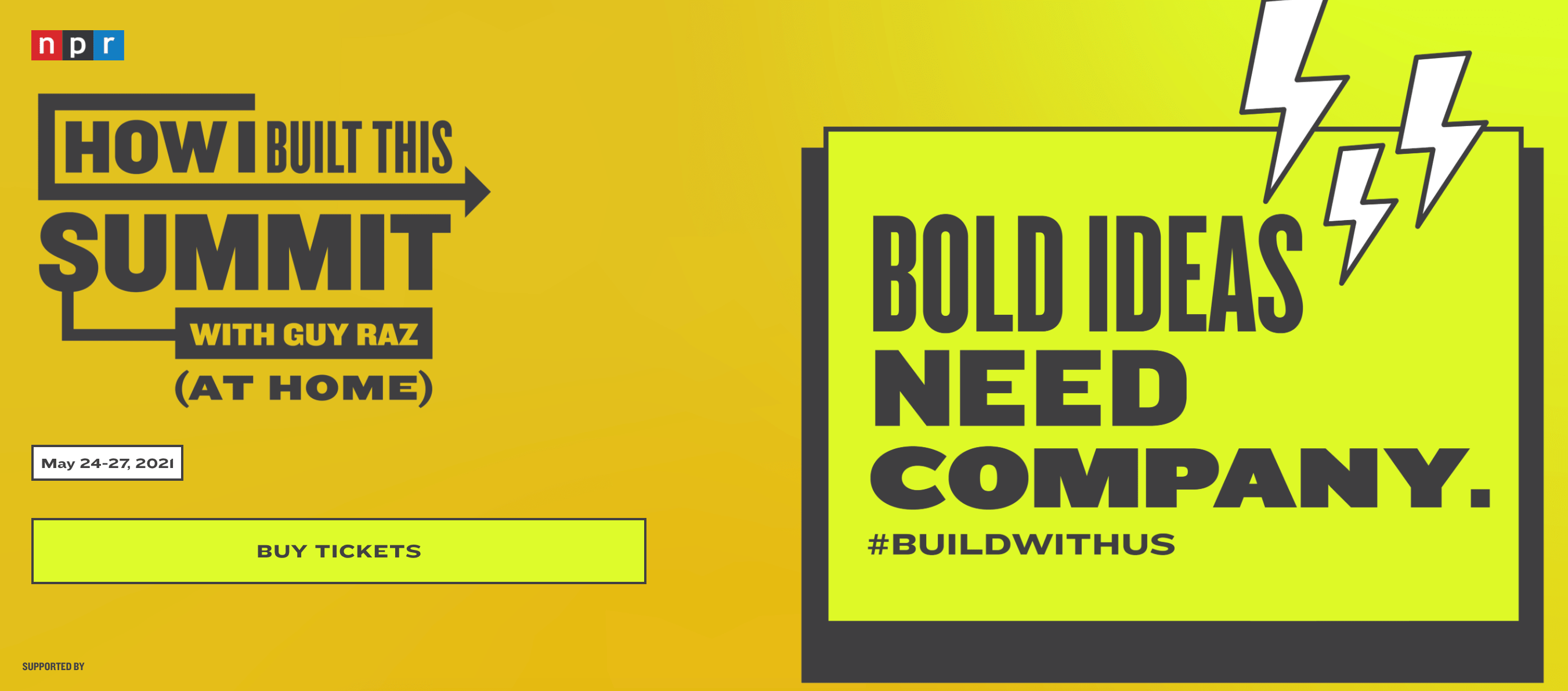
NPR begins its How I Built This Summit conference webpage with one large, compelling statement: “Bold Ideas Need Company.” The bright yellow page is simple and retro-looking, particularly with the cartoon lightning bolts in the corner.
Additionally, NPR displays an original hashtag for the conference, #buildwithus, so hestitant buyers can search for the conference on social platforms, and hear reviews, before purchasing tickets.
20. From Business to Buttons
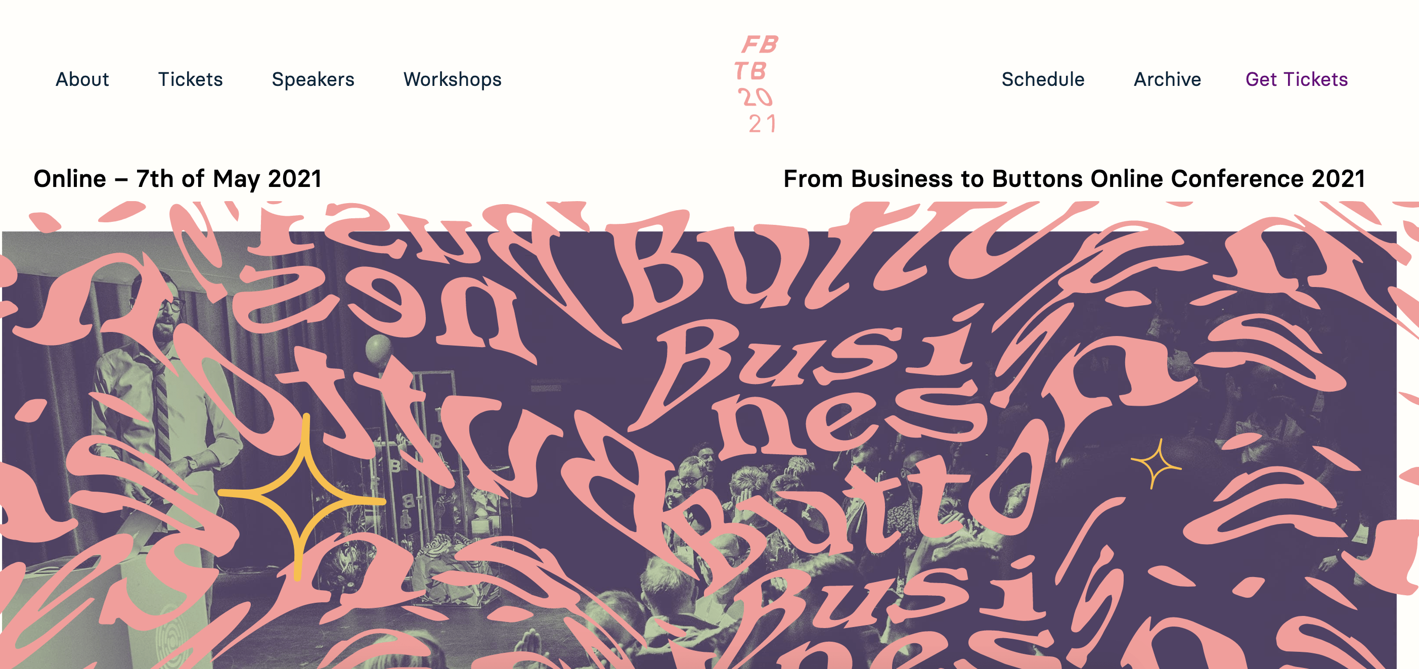 This theme, which reminded me a little bit of a carnival ride, uses bright colors and an unusual typography to stand out. The page is fun and unique, and has a clean navigation menu at the top to help visitors find exactly what they’re looking for.
21. Red Hat Summit
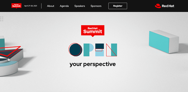
We round out this list with an incredibly simple yet sleek page from Red Hat Summit, which says only “Open Your Perspective” above-the-fold. The use of white space and minimal design elements helps to highlight this one phrase, which piqued my interest in the conference. Plus, the “Register” button is clear and easy-to-find.
Conference Website Templates
Ready to create your own?
Fortunately, there are plenty of templates available to help you craft a compelling conference website.
1. WordPress Conference Templates
If your website is hosted on WordPress, for instance, you can use one of WordPress’s themes to create an inspiring, sleek, professional website to attract and convert event attendees.
Best of all, you can start with a pre-designed theme, and then use WordPress’s easy website builder to add unique features to make your conference stand out. WordPress offers a free version, and the Business plan is $25/month.
Take a look at 21 Best Conference WordPress Themes of 2021 for more WordPress theme inspiration.
2. Wix Conference Templates
Another great option is Wix, which has a large compilation of clean, interactive conferences and meetups website templates. Wix has a free option available, and the Professional version is relatively inexpensive at just $23/month.
You can also edit your site for mobile, ensuring your mobile site visitors will want to attend your conference just as much as your desktop visitors.
3. Canva Conference Templates
Finally, take a look at Canva’s conference and event program templates. Canva is incredibly easy-to-use, with drag-and-drop features, color schemes, and high-quality stock photos, illustrations, and graphics.
Best of all, if you’re designing with your team, you can easily share your editable file from Canva and then place your colleagues’ suggestions right into Canva.
And there you have it! Now you’re ready to begin creating your own conference website to attract visitors and increase attendees to your own branded event. Who knows — maybe your company will make it on this list in the future. Good luck!