As the name implies, data visualization tools help you take raw data and turn it into something visually appealing. The benefits and use cases for data visualization are plentiful.
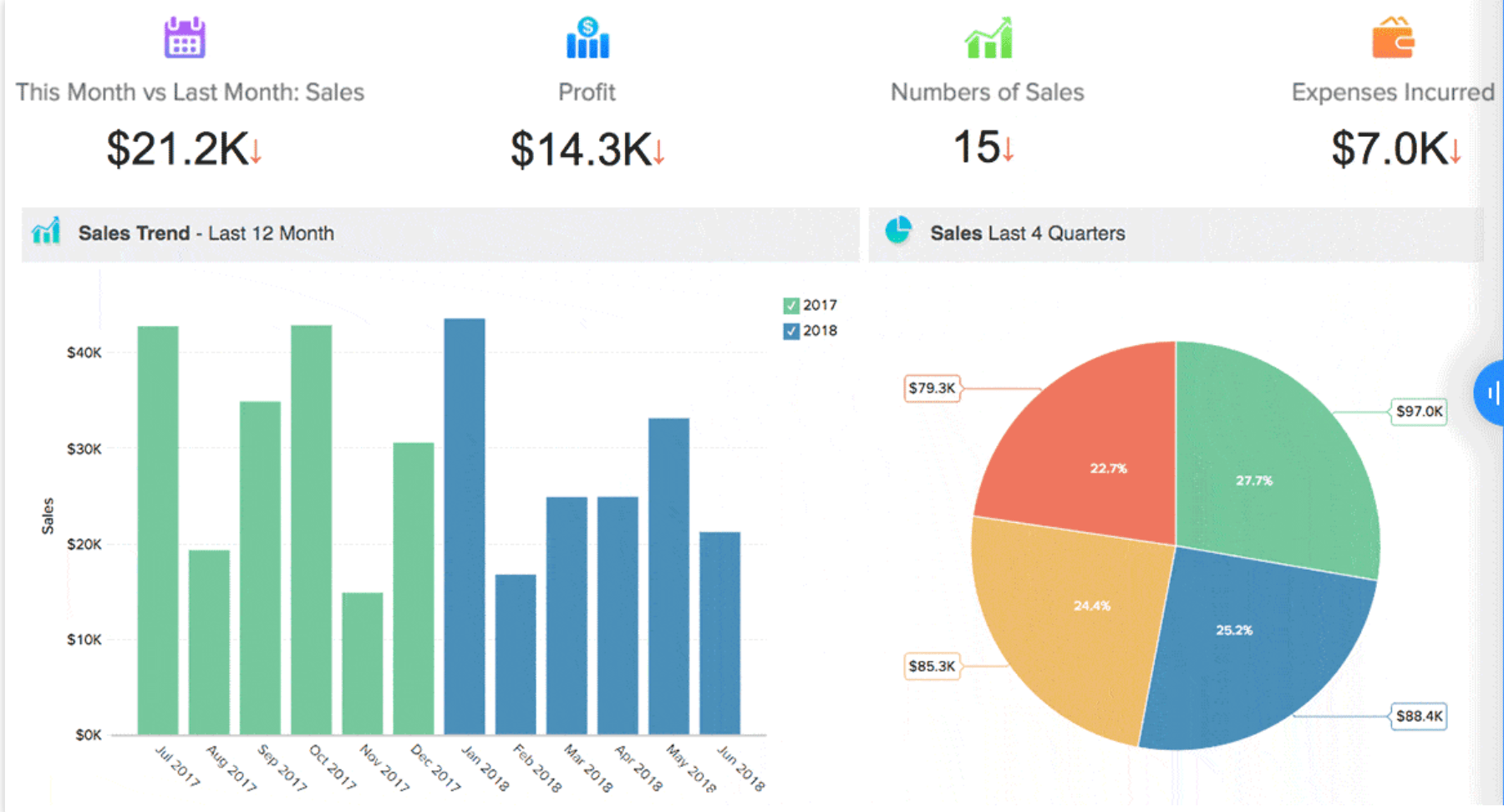
Businesses can use data visualization to analyze complex data. Rather than scanning large data queries and complex reports, you can leverage data visualization software to create a graph, chart, map, infographic, table, etc. that’s easier to understand.
By viewing a pictorial representation of data, it can give your business hidden insights while making it easier to detect trends and patterns. In many cases, it would be near impossible to recognize some patterns if you’re viewing a raw data sample in non-graphic form.
But the use cases for data visualization go beyond analytics and business intelligence.
You can use a data visualization tool to create charts or infographics to share on your website or social media accounts. People landing on your website don’t want to view spreadsheets on your landing pages; they want to see visual content.
Regardless of your data visualization needs, you can use this guide to find the best tool for your business.
The Top 9 Best Data Visualization Tools
After extensive research, I’ve narrowed down the top nine data visualization tools on the market today. Each review below contains the features, benefits, pricing, use cases, and potential drawbacks for the tools on our list.
#1 – Zoho Analytics — Best Overall Data Visualization Tool
• Starts at $22 per month
• Unlimited reports and dashboards
• Easy to use
• 15 day free trial
• Get started for free
Zoho Analytics is a reporting and analytics software for business intelligence. It’s trusted by top brands like HP, Ikea, Hyundai, Philips, and thousands of others.
The software makes it easy for non-technical users to create visually appealing data and insightful dashboards in minutes.
Simply upload your data to Zoho Analytics from any data source. Whether it be a local file, cloud drive, business application, or web URL, the import process is very straightforward.
Zoho Analytics allows you to create charts, pivot tables, and tabular view components for insightful reporting and dashboards. It has a drag and drop interface so you can make custom changes as well.
It’s easy to collaborate with co-workers and colleagues with the Zoho Analytics online collaboration tools. Embed the reports on your website, make them available for offline access, or schedule them to be emailed automatically.
Here’s a quick overview of the pricing for Zoho Analytics:
- Basic — $22 per month
- Standard — $45 per month
- Premium — $112 per month
- Enterprise — $445 per month
Even the basic plan comes with unlimited reports and dashboards. Zoho Analytics also has a free forever plan, but most business users will find it extremely limited.
Try any Zoho Analytics plan for free with a 15-day trial; no credit card required.
#2 – Tableau — Best Data Visualization Tool For Business Intelligence
• Analyze big data
• Starts at $70
• Advanced visual reports
• 14 day free trial
• Start for free
Tableau is best known for its BI capabilities. In fact, it ranks first on our list of the best business intelligence software on the market today.
But data visualization is a component of business intelligence. For larger businesses with complex data sets, Tableau will help you analyze that information. Ultimately, this tool makes it much easier for businesses to make data-driven decisions based on large sets of data.
With Tableau, you’ll have the ability to create basic types of data visualizations, like:
- Charts
- Tables
- Infographics
- Maps
- Graphs
- Dashboards
But Tableau also provides more complex and use-case specific methodologies for visualizing your data. Examples include:
- Area charts
- Box and Whisker Plots
- Bubble Clouds
- Cartograms
- Dot Distribution Maps
- Gantt Charts
- Heat Maps
- Histograms
- Radical Trees
- Timelines
- Treemaps
- Stack Graphs
The list goes on and on. You’ll also be able to any mix-and-match combinations of these visual data representations in a dashboard.
For basic users, Tableau is probably overkill. But it’s ideal for larger businesses with big data to analyze.
Pricing for Tableau starts at $70 per month, per user, with an annual contract. Try it free for 14 days.
#3 – Infogram — Best For DIY Infographics and Visual Reports
• Free for up to 10 projects
• Paid plans start at $19
• Special rates for startups & nonprofits
• Visuals optimized for mobile
• Get started for free
For those of you looking for a simple and straightforward way to make infographics on your own, Infogram is your best bet. This intuitive visualization tool is an excellent choice for individual users and small teams in need of beautiful visual content.
Design your reports in minutes and collaborate the visuals in real-time. It’s easy to download your content, share it, and publish everything online.
Infogram has an easy-to-use drag-and-drop builder that non-technical users can figure out.

You can create custom templates with colors, fonts, and logos that match your company’s brand image.
Infogram also allows you to create interactive visuals, so your content can zoom, bounce, flip, fade, slide, and more. The interactive charts and maps allow you to set up tabs, clickable legends, links, and more.
This tool is designed for people who want to share visual content online. Everything is optimized for mobile devices as well.
But if you’re looking for a data visualization tool that’s intended for data-driven business insights, you’ll find Infogram to be a bit limited. It’s not really a business intelligence solution.
You can use Infogram free for up to ten projects. Here’s a quick overview of the price points for the paid plans:
- Pro — $19 per month
- Business — $67 per month
- Team — $149 per month
Infogram offers special pricing for startups, nonprofits, and educational organizations. Just contact their sales team to request a custom quote.
#4 – ChartBlocks — Best Online Chart Builder
• Free for 50 charts
• Paid plans start at $20
• HTML5 charts
• Easy to embed and share
• Sign up for free
As the name implies, ChatBlocks specializes in making charts. This online chart building tool is easy for anyone to use, regardless of your technical skill level.
Simply import your data, pick the type of chart you want to create, and make your visuals unique with hundreds of customizable options.
By using ChartBlocks to create HTML5 charts, they’ll work on any browser and device. The charts will automatically respond to different devices and screen sizes.
Once your chart has been designed, it’s easy to embed the code on your own website or share it on social media.
ChartBlocks is free for personal use, with up to 50 active charts. However, the free charts will have ChartBlocks branding on them, so it’s not ideal for business users.
Paid plans start at $20 per month, which gives you up to 75 active charts and 500,000 monthly views. For $65 per month, you’ll get up to 200 active charts, 2.5 million monthly views, and API access.
The downside of ChartBlocks is the way the plans are structured based on active charts and chart views. But for most of you, 500,000 views per month is more than enough.
#5 – Sisense — Best For Developers and Data Engineers
• Transform complex data
• Create custom applications
• Powerful visuals
• Live or cached data models
• Request a free quote
Sisense is another business intelligence data visualization tool. But unlike Zoho Analytics and Tableau, this platform has a very specific niche. Sisense is designed for developers and data engineers.
The API-first cloud-based technology makes it easy for developers to create analytics apps and embed the content anywhere.
This self-service analytics platform allows businesses to leverage crucial insights, no matter where you have the data stored.
Sisense definitely isn’t for everyone. Basic users and people who aren’t very tech-savvy will find the platform overwhelming.
But developers and data engineers will love the ability to use a combination of live or cached data models to fully optimize the performance of analytics apps. Use Sisense to transform complex data into high-powered visuals and actionable components for custom applications.
You can deploy your apps on-premises, on the cloud, or use Linux or Windows for hybrid deployment.
As with most enterprise-grade technology, pricing for Sisense isn’t available online.
Request a quote by filling out a simple form with information about your data volume, project type, project timeline, users, and more.
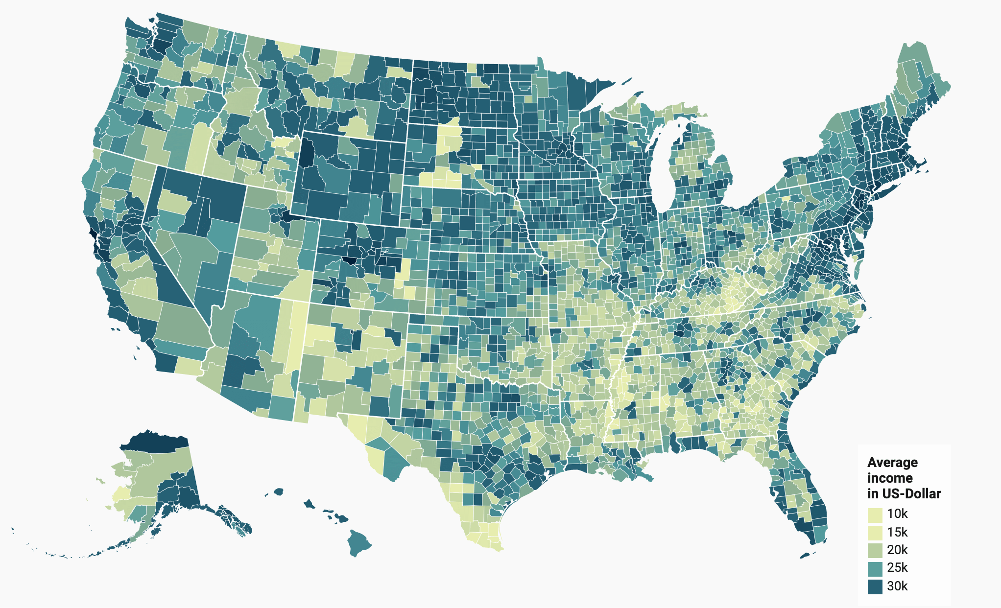
#6 – Datawrapper — Best Data Visualization For Interactive Maps
• Free for unlimited use
• Create maps, charts, and tables
• Trusted by major publications
• Paid plans start at $599
• Start for free
Datawrapper is a way for non-technical users to create interactive visuals with various data sets. It’s commonly used by publications like The New York Times, Fortune Magazine, Vox, Buzzfeed News, and more.
This data visualization tool helps you tell stories using maps, charts, and tables. So if you run a blog or news publication, Datawrapper will be a top option for you to consider.
The interactive maps feature is the offering that really separates Datawrapper from the crowd.
Other data visualization tools on the market, including some options in this guide, also offer the ability to create interactive maps. But Datawrapper blows them all out of the water.
Create symbol maps, choropleth maps, basemaps, locator maps, and more.
Whether it’s the entire globe, a country, region, or something specific, like a subway station, you can take your data and use Datawrapper to create a visually appealing interactive map.
Datawrapper is free to use for unlimited charts and tables.
To remove Datawrapper attributions from your visuals and benefit from more advanced features, pricing starts at $599 per month.
While the price tag is definitely steep compared to some of the others on our list, it’s justifiable if your website has a large reach.
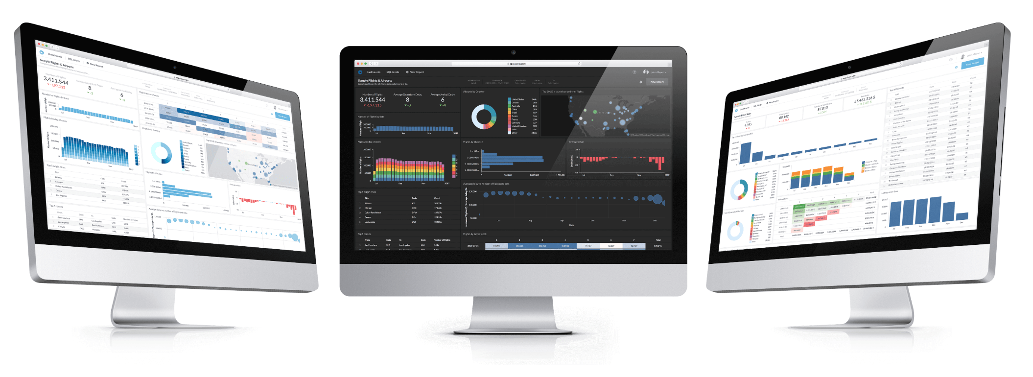
#7 – Chartio — Best Data Visualization Tool For Team Collaboration
• Cloud-based data visualization
• Team collaboration features
• Starts at $40 per user
• 14 day free trial
• Try Chartio for free
Chartio is a cloud-based data visualization tool that’s ideal for gaining insights with your company’s data. The powerful interface is an excellent source for all your most critical metrics.
Companies like DoorDash, Udacity, Squarespace, and Shazam all use Chartio to stay informed.
The platform is perfect for team collaboration across every department in your organization. Your sales teams, project managers, and customer success representatives can all create custom charts and dashboards without having to rely on engineers or data analysts.

From sales reps to your C-level executives, everyone in your organization can benefit from Chartio. You can share visualizations via Slack, email them as PDF reports, and even embed them into web pages.
Chartio also acts as a strategic partner for your organization. They provide services for live training and have data advisors that will help you get the most out of your company’s data.
Here’s a quick overview of the Chartio pricing:
- Startup — $40 per user per month
- Growth — $60 per user per month
- Premium — Custom pricing for 25+ users
Chartio is billed annually, with a minimum of five users per plan. Try it free for 14 days.
#8 – Cluvio — Best For Data-Driven Startups
• Create interactive dashboards
• Free for 3 dashboards
• Ideal for small teams
• 14 day free trial
• Start for free
Cluvio isn’t quite as popular as some of the other data visualization tools on our list. It’s only used by about 900 businesses.
With that said, Cluvio is designed for ulta-specific use cases—data-driven startups.
The platform allows your small team to analyze and create beautiful, interactive dashboards using SQL and R programming language.
Use Cluvio to transform your raw company data into professional charts and graphs that tell a story. It’s easy for teams to share dashboards and collaborate with each other while using Cluvio.
Since the Cluvio visual dashboards are interactive, you can change the data you’re viewing in real-time by adjusting filters based on custom time ranges and more.
Cluvio is free for up to three dashboards. Paid plans start at $279 per month for up to 50 dashboards and two analytics users.
While Cluvio is equipped to scale with your team as it grows, the price tag does get high. For unlimited dashboards and unlimited analysts, pricing starts at $2,250 per month. It’s more affordable for teams of up to five analysts.
Try Cluvio for free with a 14-day trial.
#9 – Whatagraph — Best Data Visualization Tool For Agencies
• Starts at $99
• Agency tools
• White label tools
• Automated reporting
• Free for 5 days
Whatagraph is a visual reporting tool for marketers, agencies, and businesses. You can collect data sources from multiple platforms and connect them to a single resource with Whatagraph.
This data visualization tool is trusted by well-known brands like Colgate, Holiday Inn, FILA, Chili’s and more.
Whatagraph is the best way to visualize the results of your marketing campaigns with data-driven graphs.
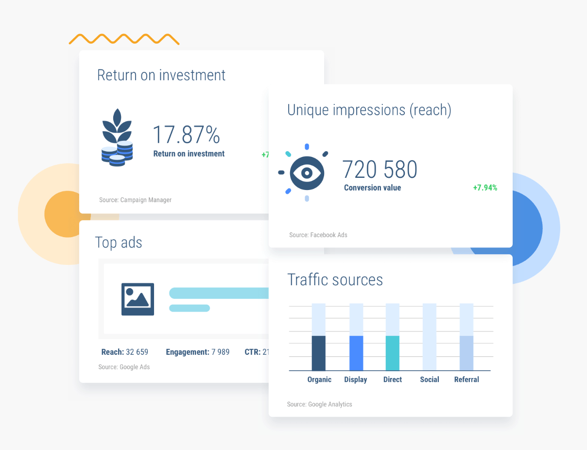
Agencies can use Whatagraph to generate automated multi-source reports for clients on a weekly, monthly, or quarterly basis.
Another benefit of the agency features is the ability to white-label your reports. Upload your logo and customize the color scheme to deliver branded visuals to your clients.
Here’s a quick look at the Whatagraph price points:
- Professional — $99 per month
- Premium — $239 per month
- Growth — $599 per month
Small businesses and single marketers can use the Professional plan for basic marketing data. But agencies will be better off with the Premium or Growth options.
Try any Whatagraph plan free for five days.
How to Find the Best Data Visualization Tools For You
What’s the best data visualization tool for your business? Generally speaking, there is no “best for everyone” solution.
There are certain factors that must be taken into consideration as you’re evaluating a prospective tool. This is the methodology that we used to come up with the winners on our list.
Data Formats
The first thing you need to look for is the type of data formats that the tools support. Make sure that your data sources can easily connect to the platform without having to do any complex file conversions.
This is crucial for organizations that are using a data visualization tool to analyze big data.
Visualization Methods
Some solutions will just create simple tables, charts, and graphs. For many businesses, this is more than enough to meet their needs.
But other organizations need much more. Interactive maps, advanced visual reports, and interactive dashboards are just a handful of visual components to keep an eye out for.
Specialty Solutions
Not every data visualization tool is created equally. Some tools are made with specific use cases in mind.
For example, there are certain tools made for developers and data analysis. Other tools are designed for agencies, or they specialize in a specific type of visualization, such as maps or charts.
Sharing and Collaboration
What happens after your data has been turned into a visual format?
If you want to embed it on your website, collaborate with team members, share it on social media, or email it to your clients, you need to make sure that the tool supports your needs.
Conclusion
Zoho Analytics is our top overall recommendation for data visualization tools. But it’s not for everyone.
For those of you who want to leverage business intelligence for big data, use Tableau. Data engineers and developers should lean towards a solution like Sisense. Whatagraph is our top recommendation for agencies. Non-technical users that just want to create simple charts should lean towards ChartBlocks or Infogram.
Refer to the “best for” qualifiers that I highlighted in this guide for other use-case specific tools for your business.