
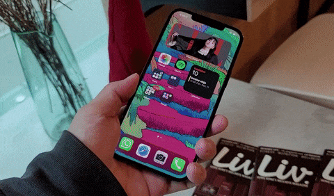
If you use an iPhone or have been around iPhone users long enough, you will likely have pulled off, or have seen others do this move in the gif below. This “loosen grip to slide a hand up the phone so the thumb can reach the top of the screen” action is as much a part of an iPhone user’s muscle memory as swiping up to go home. All my friends who own iPhones do this. I’ve seen Apple staff at Apple events do this. Heck — I do this, because I use an iPhone from time to time. And with big Apple phones like the iPhone 12 Pro Max, I am doing this far more often than I would like.
I already know what some iPhone users are thinking “well, if you choose to use a phone with a huge screen, then you have to sacrifice on ergonomics.”
But what if I told you it doesn’t have to be this way? The Samsung Galaxy Note 20 Ultra, the LG Wing, and the Huawei Mate 40 Pro are as large — in some cases taller — as the iPhone 12 Pro Max, but I don’t have to pull off hand gymnastics to do something basic and repetitive like pulling down the notification shade. I can still use those three phones one-handed without any issues.
Their longer/narrower aspect ratio and curved sides help, sure, but it goes beyond that. The biggest reason I can one-hand a Galaxy Note 20 Ultra or LG Wing in ways I can’t do with the iPhone 12 Pro Max is because they have software that has adjusted for their larger screens.
The problem is, as the article title already spoiled, iOS.
The iPhone 12 Pro Max screen is just a supersized iPhone 12 Mini screen
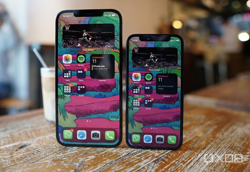
The iPhone 12 Pro Max rocks a 6.7-inch display, while the iPhone 12 Mini packs a 5.4-inch screen. Despite the drastic size difference, the UI for both phones is exactly the same. You can’t place more apps onto the Max homescreen than you can on the Mini. You can’t have more widgets. Everything is exactly the same, except they’re larger — often unnecessarily so.
Think about how absurd this is. The amount of space we have to put things, whether physical or virtual, is often the number one factor in how we organize our things. Space (or lack thereof) dictates how we place our furniture in our living rooms; how we organize our desks; how many windows we open on our computer screens; and so on.
Apple, somehow, did not see a need to adjust its UI even a bit for its largest iPhone ever. The homescreen grid still locks you into having four apps at most horizontally, resulting in comically large app icons. The PIN pad, too, is placed in the center of the screen and generously spaced, just like every other iPhone over the past few years. But while this PIN pad placement is fine for most iPhones, it’s downright user-hostile on the Max iPhones as my thumbs can’t reach the top row (1-3) keys without loosening my grip and stretching my hand. And in this age of mask-wearing, I need to use the PIN pad on an iPhone roughly 50 times a day.

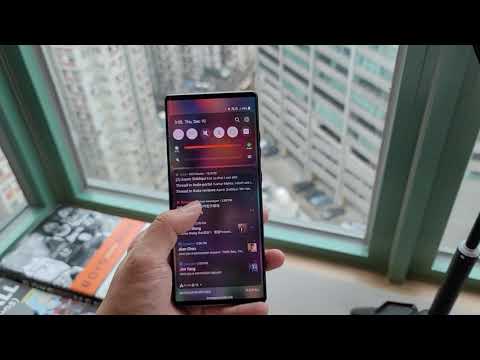
Backing up to that first problem mentioned at the beginning of the article — the reason iPhone users have to dramatically readjust their grip just to pull down the navigation shade or the “Control Center” is because iOS still requires you to swipe from the very top of the screen to access either menu. Almost all Android brands allow you to bring down the notification shade by swiping down from anywhere on the screen, so you don’t have to reach for the very top. The video below shows me accessing the notification shade on the 6.8-inch LG Wing and then on the 6.7-inch iPhone 12 Pro Max.
The lack of a truly free homescreen on iOS
But things like the PIN pad placement are not my biggest gripe, because I can see how it was just a harmless oversight from iOS engineers — after all, Face ID had worked so well in the pre-mask era that the PIN pad was rarely ever needed.
Instead, my biggest gripe with iOS is its restrictive homescreen grid, which still forces users to place apps in a top-down, left-to-right system. The big reason I can still use a 6.9-inch Galaxy Note 20 Ultra screen one-handed is that I place all my apps at the bottom of the homescreen. I’ve seen some people place apps entirely on the left or right side of the screen for easier thumb reach. The point is, we have total freedom over where to place our apps, and we can also use a tighter grid to fit more apps into the dock or bottom row. These apps form the cornerstone of the experience on the device, and opening them from the icon represents one of the most common actions that all users undertake on a daily basis.
Just look at the photo below and tell me which homescreen seems easier to maneuver with one hand.

I already know some of the excuses — because I’ve vented about this on social media before and heard the same — “just fill the homescreen with more apps and widgets and push the apps you need most to the bottom of the screen.”
That “fill your homescreen with unnecessary stuff” solution really shouldn’t even justify a response, but I’ll give one anyway: I don’t want to fill my homescreen with stuff. I like being able to see my wallpaper; I like my homescreen to have just the essentials. Wanting empty space on a homescreen isn’t a big ask in 2020, when OS’s and app ecosystems have long matured to stability.
Reachability on iOS isn’t as good as a proper one-hand mode
Another reason the Samsung Galaxy Note 20 Ultra and Huawei Mate 40 Pro are easier to use with one hand is that they all offer a “one-hand mode” that shrinks the screen both vertically and horizontally. Triggering the one-hand mode requires just a simple gesture, and once there, I can type away as if I’m using a 4-inch screen.

One-hand mode on the Samsung Galaxy Note 20 Ultra
The iPhone 12 Pro Max has a one-hand mode too, which Apple calls “Reachability,” but it doesn’t work nearly as well. Instead of shrinking the screen’s height and width indefinitely like many Android brand’s implementations, Reachability only shrinks the height of the screen, and it’s a one-time action: once you tap on a part of the screen it returns to full size.
Inconsistent methods for “go back” navigation on iOS
One of the core fundamental differences between Android’s UI and iOS’ UI is that Android has almost always had a consistent button or gesture to “go back” — it used to be physical buttons, then on-screen buttons, and now in most cases a swipe-in-from-side gesture. Android’s “back” action is universal — it goes back one level no matter what app you’re using, and if you do it enough times you will always be able to back all the way to the home screen.
iOS, meanwhile, has a looser set of rules. In most apps, especially native iOS ones, you can go back by swiping from the side, but some third-party apps don’t support that, instead requiring you to tap a button usually located on the upper left corner to go back one level. Some apps, even native iOS ones, will support the swipe back gesture in certain parts but not other parts. For example, in the Photos app, swipe from sides go back a layer if you’re browsing albums, but as soon as you’re inside an album the side swipe cycles through photos instead and you need to swipe down to go back.
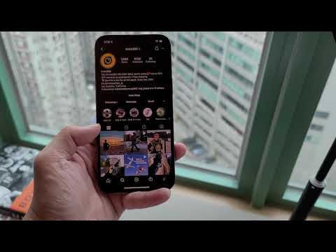
And once you’ve backed to the base layer of the app, your back action no longer works. You then have to swipe up, or press home button on older iPhones, to exit the app. If it is an app whose UX you are not familiar with, it can be a little difficult to figure out when you’ve reached the point of a swipe up gesture without attempting a few failed swipe-ins. The video below shows me backing out of multiple layers within Instagram all the way to the homescreen on Android with one gesture, while iOS requires a change in action.
The inconsistency in UI navigation has been an issue of iOS for over a decade, but it was more manageable on a smaller device. On the iPhone 12 Pro Max, it just results in more readjusting of grip.
The aspect ratio and boxy build of the iPhone 12 series
As I mentioned at the beginning, the iPhone 12 Pro Max’s wider 19.5:9 aspect ratio compared to the at least 20:9 aspect ratio of rival Android phones is also a factor, as the width of a phone plays a more important role in the phone’s in-hand feel than height. So while the LG Wing is even taller than the iPhone 12 Pro Max, the LG Wing’s narrower 20.5:9 aspect ratio means my fingers can wrap around the device easier.
The iPhone 12 Pro Max’s extra girth is compounded by its new boxy design with hard edges. I know curved screens are not everyone’s cup of tea, but I think we can all agree rounded sides on the frame and edges are easier on our palm than boxy sides with relatively sharp edges.
But ultimately, the iPhone 12 Pro’s hardware design is not the biggest contributing factor. The problem is still ultimately iOS and its draconian rules.
The good news is there is a third-party app that can help alleviate the problem. Clear Space is a $2 app that essentially allows us to place invisible (transparent) widgets on iOS14, which can then push the apps we use most to the bottom of the screen while giving off the illusion of a cleaner, spaced out homescreen.
Well, after paying for a third party app that makes invisible widgets I finally can set up a Max iPhone home screen to allow easier thumb reach to core apps WITHOUT filling entire home screen with stuff. I mean iOS should just let us do this natively. pic.twitter.com/ntpVWnjOzB
— ben (@bencsin) December 5, 2020
Saying “just get the smaller iPhone” gives Apple a free pass for poor software decisions
I understand that, to some readers, this whole article came off as nitpicky, because depending on your lifestyle or location, you may not need to use your phone one-handed often. As someone who lived four years of my teens in Northern California not far from Apple’s headquarter, I know that life in NorCal is far more laid back than in places like New York, London, or Hong Kong. There’s plenty of space in Northern California; everyone has their own car, so there’s not a lot of walking as a means of getting around. If you live that lifestyle, you probably always have a free second hand to tap that button on the upper left corner, or swipe from the upper right corner of the screen.

But I live in Hong Kong, one of the most densely populated places in the world, and a city in which most citizens rely on walking and public transport. I need to one-hand my phone often as I’m trying to respond to a text while standing in a packed train with a hand holding groceries; or maybe I’m walking down a crowded street typing an email with one hand while the other hand is holding a coffee. I know people in other crowded big cities, from London to Dubai, Tokyo to Shanghai, all live similar lifestyles. For us, one-hand usability is important.
XDA’s managing editor Aamir Siddiqui echoes the same thought. He recently switched to the iPhone 12 (not the big Max) and even then he found it jarring to adjust to the hand gymnastics required to navigate around iOS compared to the OnePlus 8 Pro, which is larger in size.

Telling us to “just get the smaller iPhone” — which is a frequent response I get on social media when I lament the Max iPhones being hard to use — is not the right response. As I’ve made my case already — it doesn’t have to be this way. Big phones with screens north of 6.6-inches can still be optimized for one-hand use. Apple just doesn’t really care. But if enough of us point it out, maybe it will.
The post The iPhone 12 Pro Max is hard to use with one hand because of iOS, not screen size appeared first on xda-developers.