
The growing need for AI for data visualization sparked enthusiasm in many companies. New solutions are emerging daily, so choosing the right one can be tricky. I’m here to share my experience and reveal the best solutions with unique AI-powered visualizations.
Best AI for Data Visualization
I needed a data set to test the usability and output of different solutions. I’ve decided to go with one statistic I’ve discovered while researching how many cell phones are lost daily.
1. Graphy
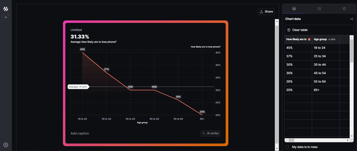
The best balance between advanced features and usability.
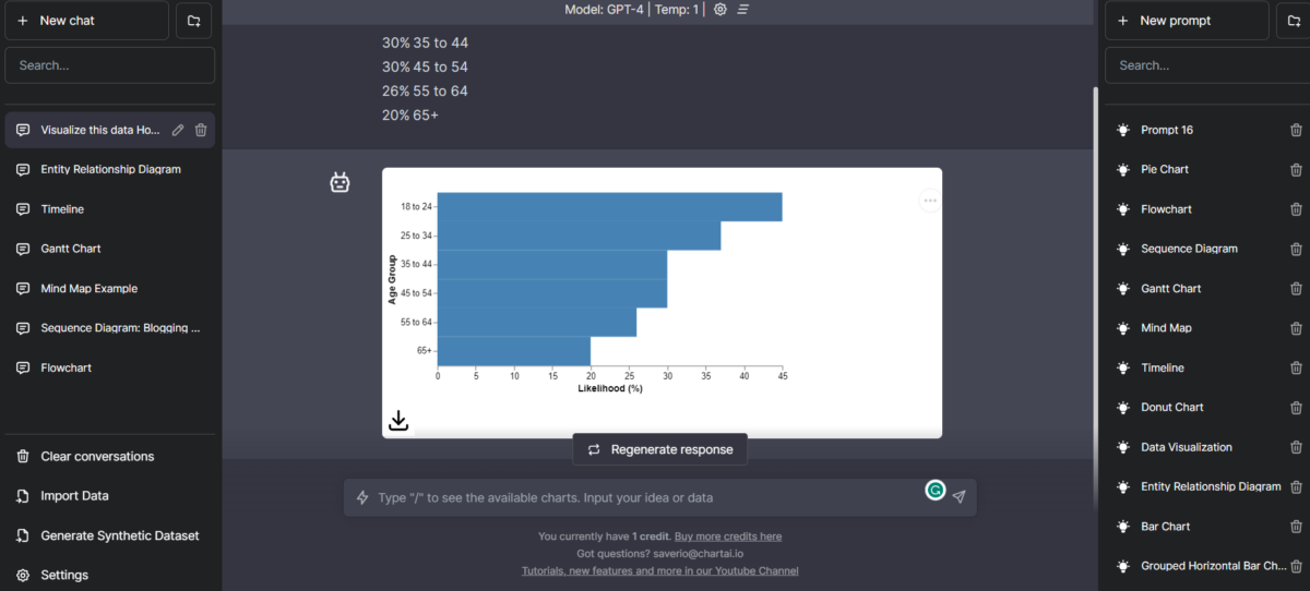
Simple user interface, quick result generation, and overall the best user experience. These words describe Graphy, the interactive AI-powered data visualization builder.
It took me less than a few minutes to generate my first graph!
An excellent detail is that you can orient the data set you import through rows or columns. Graphy also has fantastic styling options. Even the default colors look professional and minimalistic.
| Pros | Cons |
| Interactive and user-friendly | Lacks some advanced options and features |
| Great styling options | |
| Suitable for presentations | |
| Quick to get started with (beginner-friendly) |
2. Akkio
AI-powered chat allows seamless interaction.
If you’re experienced in visualizing data but want an additional push from AI, Akkio might be perfect for you.
Akkio accepts 14 inputs and integrations (Table, Google Spreadsheet, Snowflake, etc.) This provides flexibility and makes it quick to get the most out of it.
Once you import the data, you can describe the goal you want to achieve. This helps the AI-powered system to recognize patterns better and create valuable insights.
A few features gravitate around collaboration. The whole platform is designed to be used by (big) teams, and it includes Slack integration.
| Pros | Cons |
| Suitable for experienced users | Steep learning curve |
| 14 types of inputs and integrations | Users can add prompts to optimize insights |
| Users can add prompts to optimize insights | |
| Great collaboration features |
3. Polymer
Perfect for digital marketers looking for a solution for multiple messy dashboards.
Polymer is marketed as a Business Intelligence solution suitable for beginners. Although the interface is clean and simple, I won’t recommend it to somebody unless they’re serious about data visualization.
Polymer is ideal for gathering all data in one interface and visualizing it as needed.
Besides the existing integrations for Google, Facebook, Shopify, and others, you can also create your own template.
Once you import your data, AI will automatically analyze it and recommend the best way to visualize it. This is a significant help if you’re unsure how to present a specific data set.
| Pros | Cons |
| Suitable for digital marketers | Requires decent data visualization knowledge |
| Centralized dashboard for many data sets | Automatically suggests the best way to visualize |
| Automatically offers the best way to visualize | |
| Out-of-the-box integrations are available |
4. ChartPixel
Simple and easy tool for everyday AI-powered data visualization.
Are you new to AI data visualization? If so, ChartPixel might be a great way to get started!
It has an interestingly designed data library, which you can use if you don’t have a data set ready. You’ll get several things once you upload your data or choose from the data library.
First is the customizable chart, which represents your raw data. Next is a textual analysis of the provided data and interesting AI-generated points.
Although not directly related to data visualization, the Speculate feature lets you get some exciting ideas about the data set. This can be very interesting for content creators.
Generated data visualizations can be saved on ChartPixel or downloaded as (.png) images.
| Pros | Cons |
| Suitable for beginners | Lack of advanced features |
| Nice and organized UI | Not many collaboration features besides sharing completed work |
| Additional features like Speculate and Insights | Limited charts and customization features |
| Decent data analysis summary option |
5. Julius
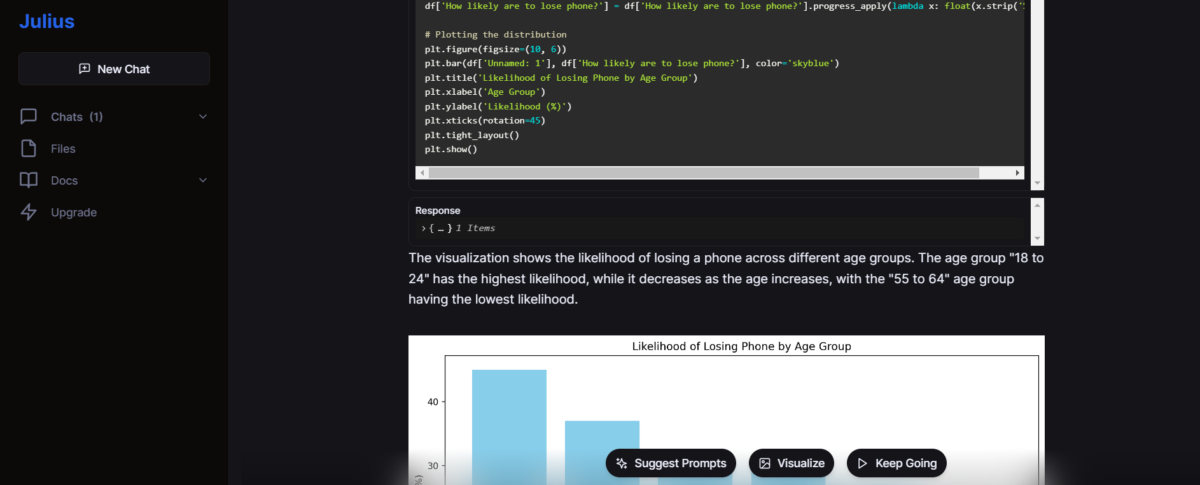
An ideal solution for Python developers
Julius is an AI chatbot that writes Python code for real-time data visualization. Like many other chatbots, it can also generate dummy data you can use for further development.
Moreover, it has a descriptive approach while interacting with the user. In other words, the AI generates the comments, code, and visualizations.
If you’re a newbie or junior Python developer working in the field of data visualization, Julius has the potential to become your best friend!
Styling options are limited, and it can sometimes generate a faulty code. The good news is that Julius will redo the process until it gets it working.
| Pros | Cons |
| Suitable for Python developers | Output isn’t visually appealing |
| Generates process and the result | Can generate faulty code |
| Responsive chatbot for data visualization | No collaboration options |
6. ChartAI
If you’re a fan of ChatGPT, you’ll have no problems using ChartAI.
ChartAI has a very familiar interface (almost identical to ChatGPTs) and a responsive AI chatbot creating data visualization.
It even uses the GPT4 model to achieve this!
Many competitors in AI data visualization don’t reveal the specific model their system relies on. However, ChartAI aims to provide a seamless experience by doing precisely that.
This makes interacting with the chatbot extremely easy and familiar for ChatGPT users.
There are dozens of premade prompts that serve as templates for various charts. The downside is that you can’t expect perfectly styled or formatted results.
| Pros | Cons |
| Familiar and easy-to-use UI | Overall experience gives a ‘still in development‘ feeling |
| Premade prompts/templates | The results are often inaccurate |
| Familiar and easy-to-use UI | Lack of advanced features |
How To Visualize Data with AI
Now that you’re more familiar with AI for data visualization, it’s time for action! For this demonstration, I’ll use the most balanced solution on this list, Graphy.
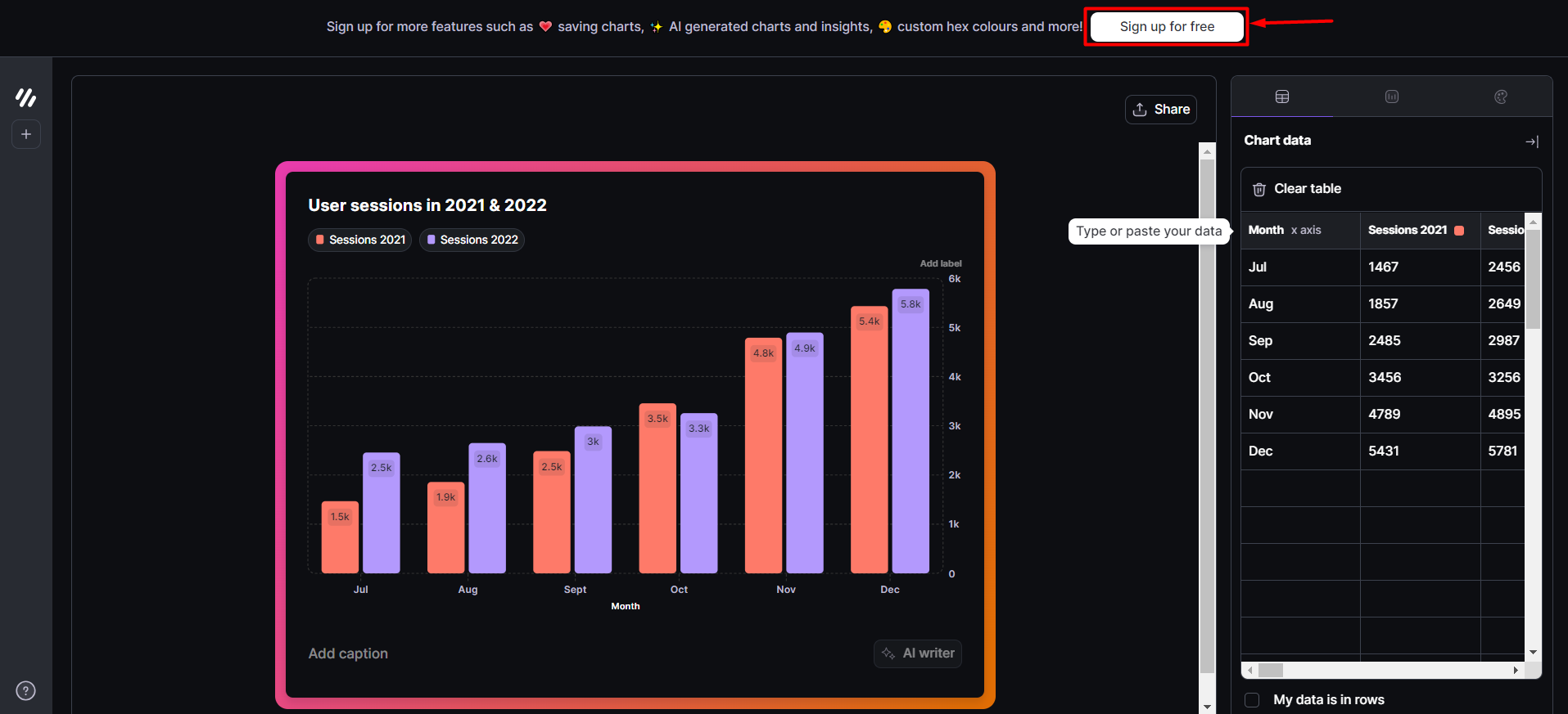
- Open the Graphy visualization app and hit the Sign up for free button.
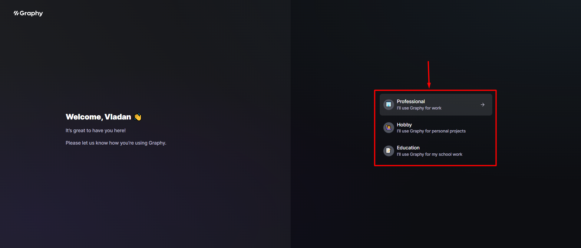
- Select one of the three proposed options.
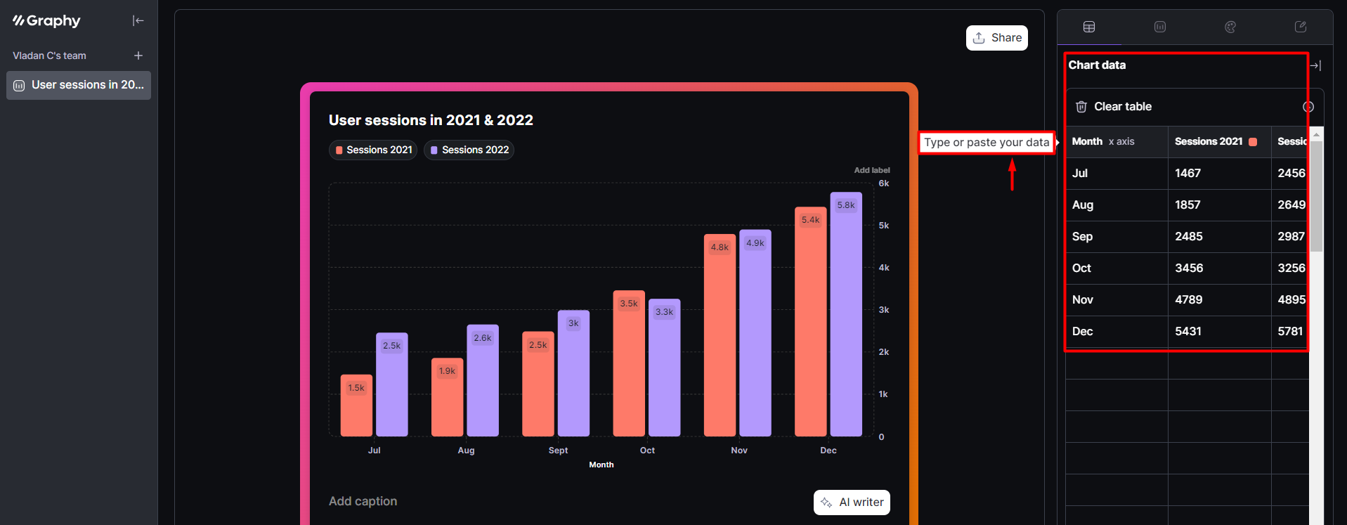
- Fill in the chart with your data.
Mark My data is in rows if needed.
- Navigate to the Chart type tab and select one of six available options.
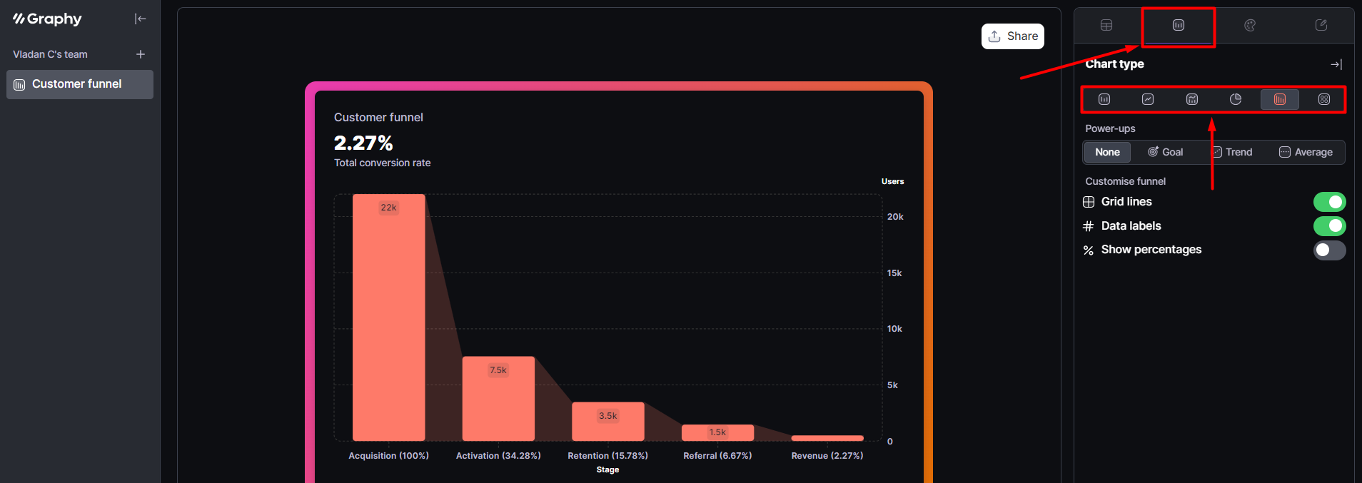
- (Optional) You can also enable some of the Power-ups or use other customization options.
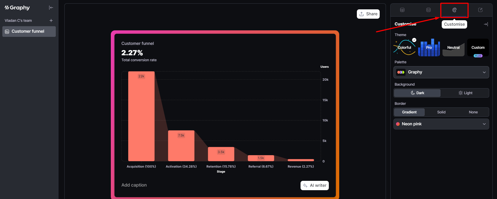
- Visit the Customize tab to change styling or colors.
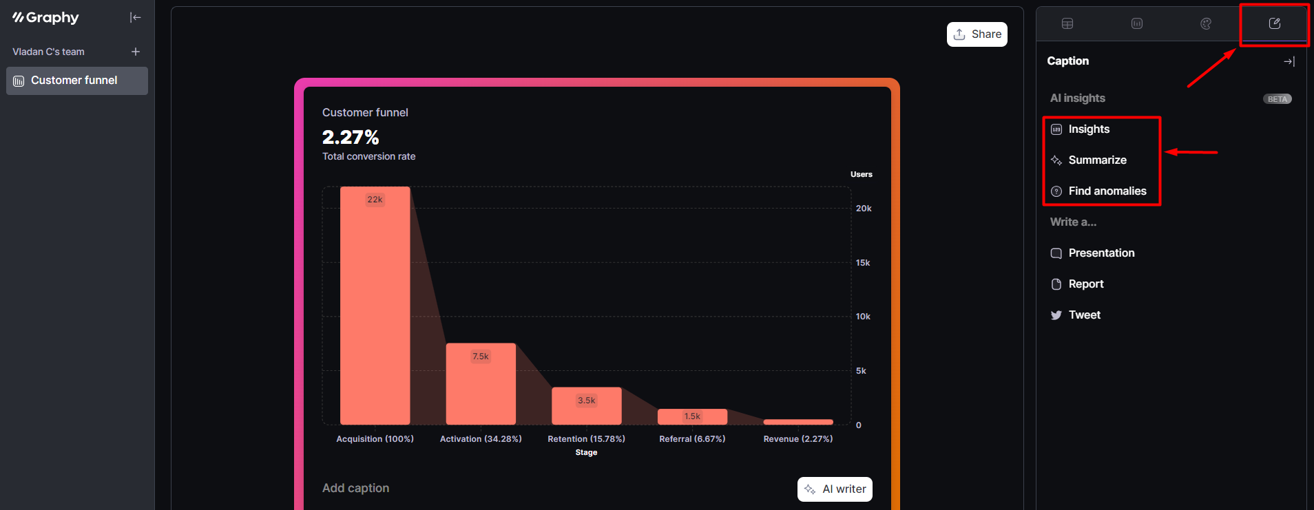
- Go to the Caption tab and find AI insights.
- Insights will generate an analysis based on your data.
- Summarize will create catchy textual content with emojis.
- Find anomalies will search for patterns in your data set.
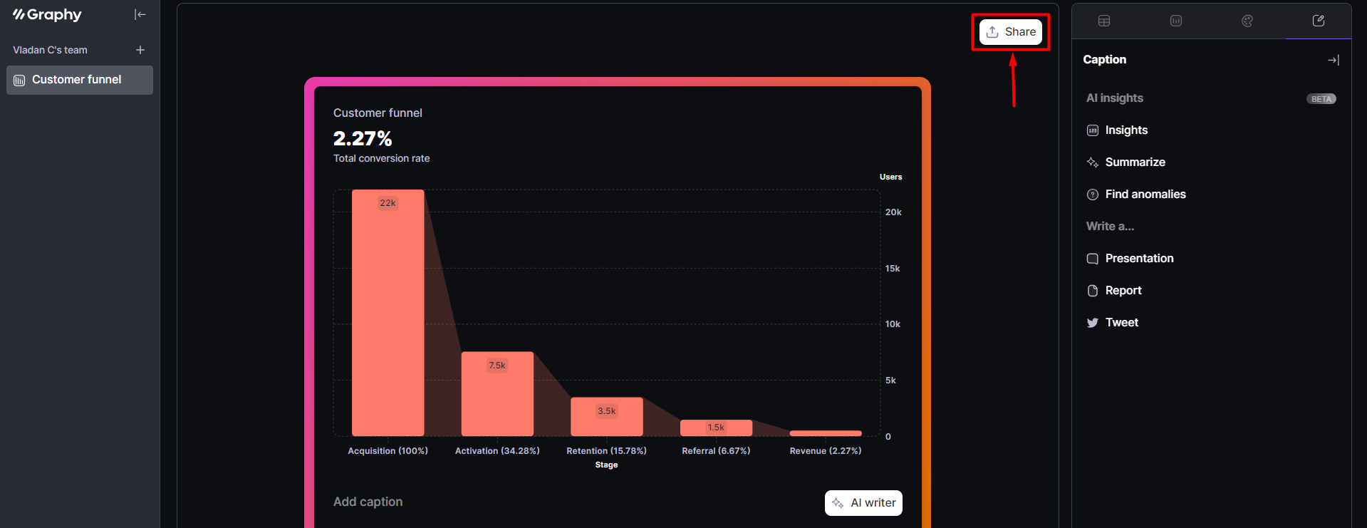
- Once you’re done, you can use the Share button.
- Share link creates a unique URL for data visualization on the Graphy platform.
- Embed lets you add your visualization to Notion, Slack, Canva, or Tome.
- Image can be used to download your visualization in different aspect ratios.
Harnessing the power of AI for data visualization is more than accessible with the various available tools. However, choosing the best one for your use case isn’t easy, and I hope my experience helped you out.
If you aren’t sure what you’re going after or have various needs, I recommend starting with Graphy. It’s accessible, has all the necessary features, and nicely incorporates your desired AI options.